
A Blind Genetic-Distance Quiz

Take a look at these numbers before you read any further.
No academic setup. No complex categories. Just a few geographic labels and a standard metric used by geneticists to measure genetic distance, called FST.
How it works: This metric measures genetic differentiation between two groups. A Fst value means the two groups are genetically identical. The higher the number, the more genetically distinct (”distant”) the groups are from each other.
The labels below are intentionally partial, just familiar enough to give you context, but vague enough to keep the game honest.
What are you looking at? Modern human populations? Isolated island communities? Old-fashioned continental categories dressed up in modern genetics?
Make your guess before reading the next line.
The Labels Come Off
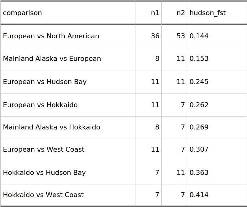
Those are bears. Specifically, these are brown bear (Ursus arctos) populations pulled from a genomic dataset. “European,” “North American,” and “West Coast” aren’t human groups here, they are bear populations with the word “bear” scrubbed out.
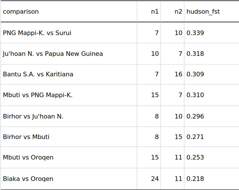
Now, let’s look at actual human data using the exact same metric, matched for comparable, small-to-moderate sample sizes so the math stays fair.
These are modern human population comparisons from theHudson FST table. I shortened some labels so the table stays readable, but these are human groups.
People expect a clean ladder of nature: humans at the bottom (low genetic diversity), animal subspecies in the middle, and distinct animal species at the top.
But look at the data. While the first table has a massive outlier (Hokkaido vs. West Coast at 0.41), the human table easily hits values between 0.22 and 0.34. These aren’t different human species; they are modern human populations.
The lazy argument, that animal populations are inherently far more genetically distinct than human populations, fails. It is true when comparing different species (like a brown bear vs. a polar bear). It is not true for standard regional populations within the same species.
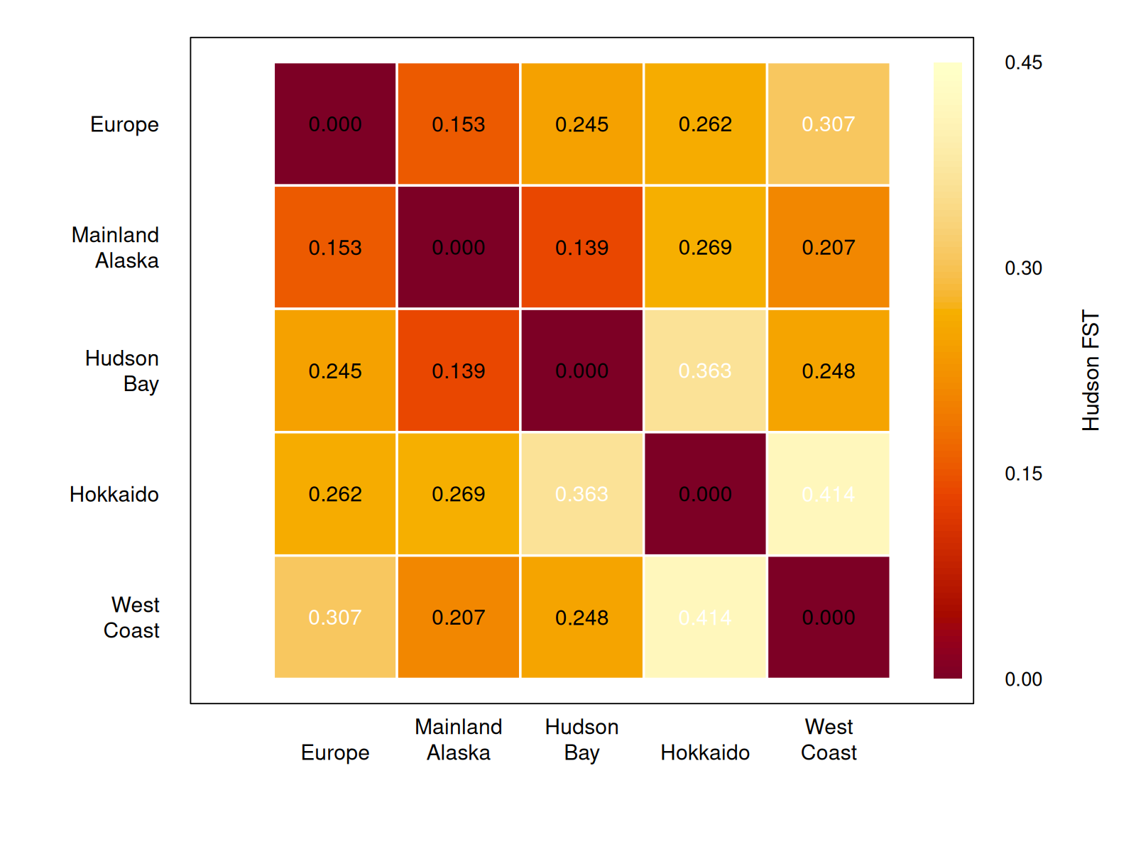
A heatmap makes the same point more directly. Among these brown-bear populations, Europe and Mainland Alaska are relatively close, Europe and Hokkaido are farther apart, and Hokkaido versus West Coast is the most separated pair in this small set.
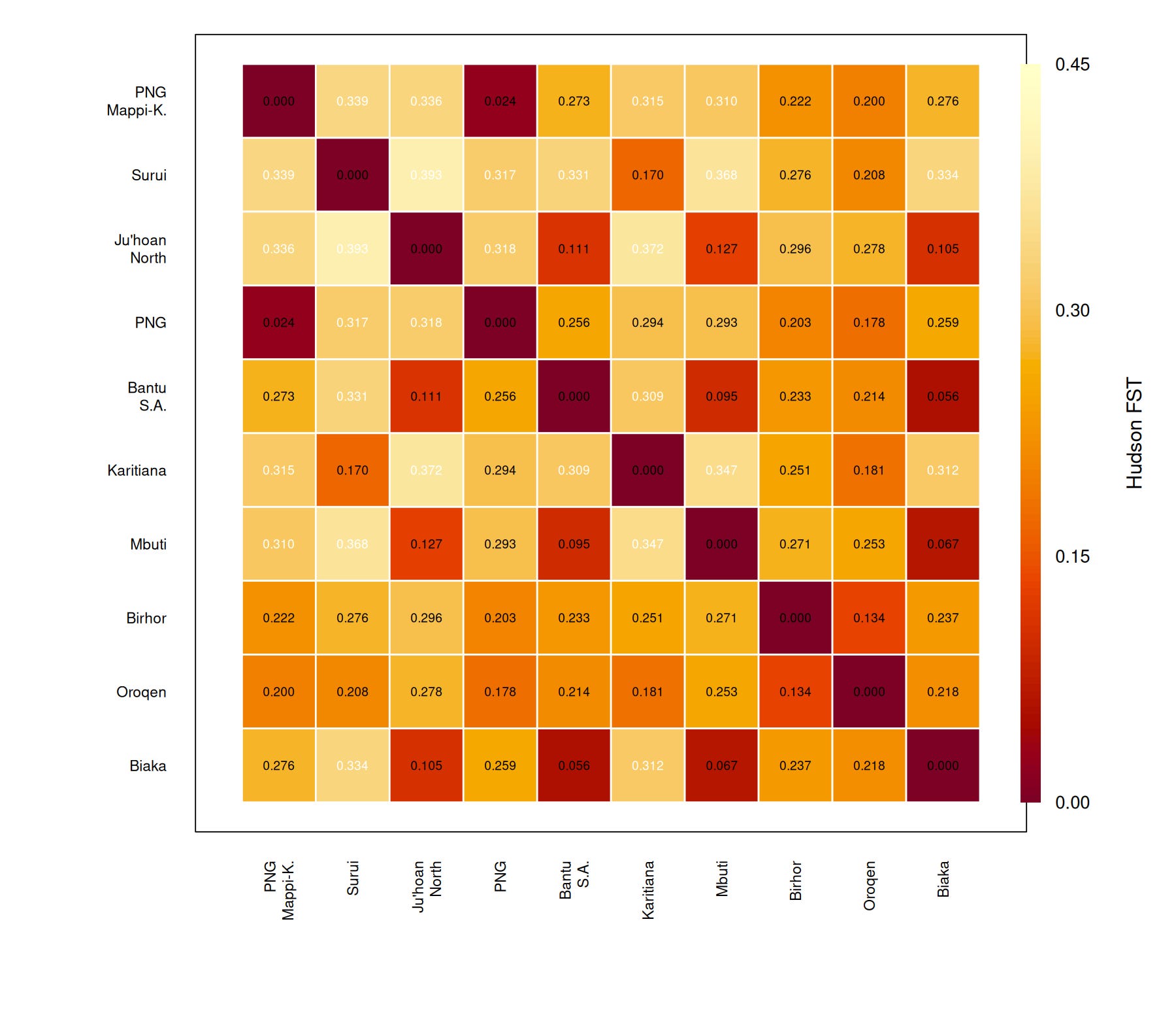
The same view for the matched human examples
For comparison, here is the FST matrix for the human populations used in the matched example table. The color scale is the same as the bear heatmap, so the two figures can be read against each other directly.
But this raises a massive problem. If the numbers overlap this perfectly, why does every textbook claim that human genetic diversity is uniquely low compared to animals?
The answer comes down to a glaring methodological flaw in how we sample animal populations, and a statistical illusion that has distorted the literature for decades.