
Am I really Northern Italian? I tested it with a reference panel
A reproducible workflow using AADR

All four of my grandparents are from Northern Italy.
So I did a simple experiment. I took my 23andMe data and placed it on a reference panel of Europeans (plus Middle Eastern populations as an anchor). If family background tracks genome-wide similarity the way we expect, my point should fall right where it “should”: inside the Northern Italian cluster, not Central, let alone Southern Italian.
I expected this to work, but I also expected to lose an afternoon to unavoidable boring pipeline mistakes (SNP overlap, strand flips, labels). I did.
This started for three reasons.
First: family curiosity. I’m not sure where my more distant ancestors are from.
Second: readers kept asking. After I posted a few genetic plots, people started messaging me some version of: “Can you do this for me?” Not in a vague “tell me my ancestry” way, but in a practical way: “Where would my data land on the same panel you’re using?” I realized there’s real demand for a clear, repeatable method, not a one-off screenshot.
Third: I wanted a reproducible pipeline for this kind of work. If I’m going to offer reference-panel placement as a perk for Yearly subscribers and Founding members, it can’t be artisanal or ad hoc. It has to be a pipeline that:
runs the same way every time,
uses a defined reference panel,
avoids the common pitfalls (SNP overlap, ambiguous SNPs, pruning choices, projection artifacts),
and produces a plot that I’d be comfortable sending to someone else.
For the reference panel, I used the Allen Ancient DNA Resource (AADR) curated by David Reich’s group—a version-controlled compendium of published ancient human genome-wide data (plus selected present-day references) standardized for population-genetic analyses. In this post, I used AADR v62.0 (Dataverse 9.0; released 16 Sep 2024).
This is the plot produced by running the analysis end-to-end inside PLINK2 and then labeling/plotting in R. It’s the most “pragmatic” route: fast, stable, and it behaves well with mixed data sources like consumer genotypes plus a reference panel.
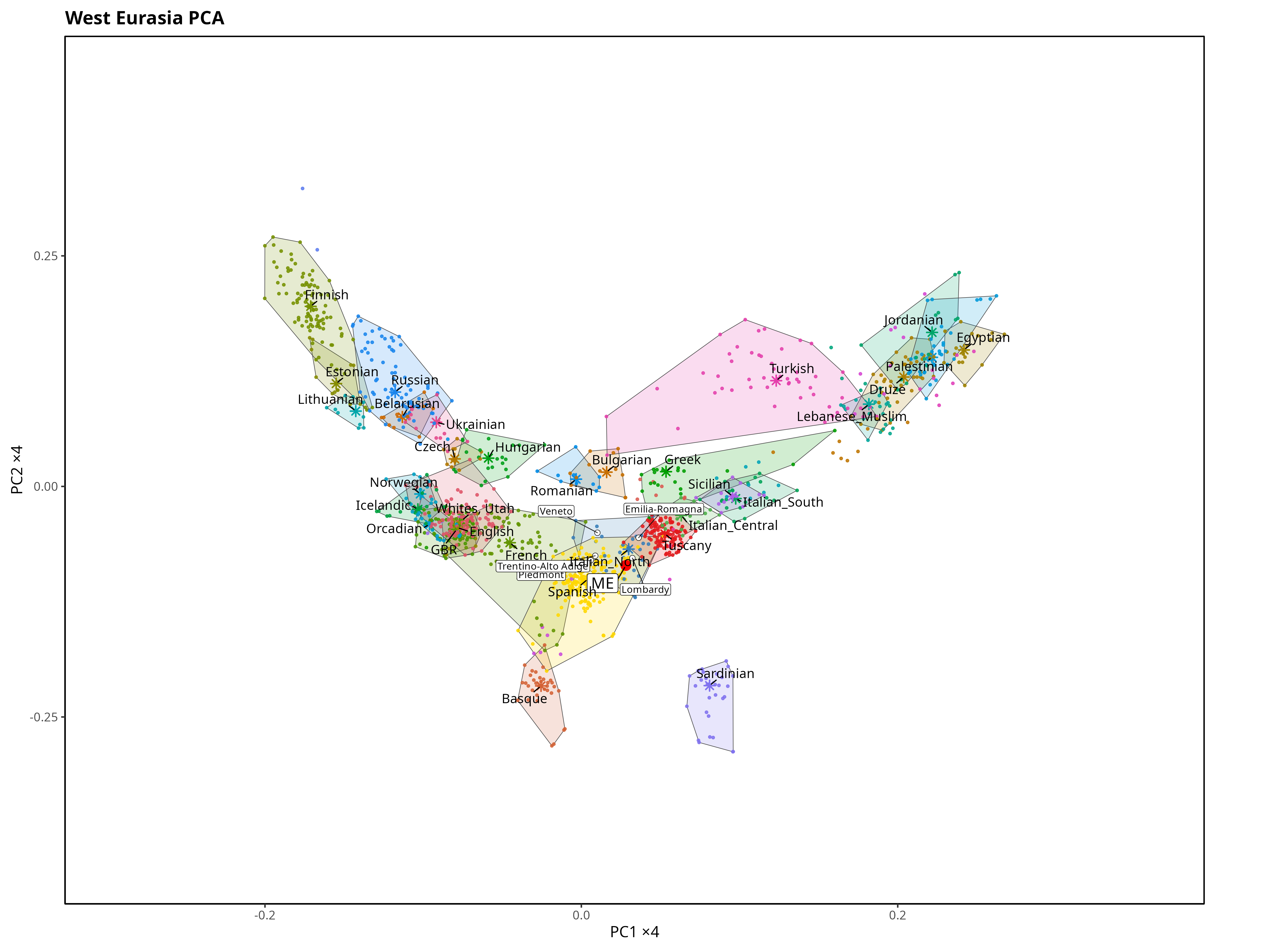
PC1 is on the x-axis and clearly tracks the north–south (latitudinal) gradient, with higher values corresponding to northern latitude. PC2 on the y-axis mainly reflects the east–west (longitudinal) gradient (higher values, more East).
The Northern Italian samples are highlighted in blue to make it easier to see where my sample falls.
My sample lands inside the North Italian cluster, which is exactly the sanity check I was hoping for.
The Iberian sample largely overlaps the North Italian one, but it sits slightly more to the west relative to the North Italian centroid. My genome is also shifted a little northwest of the North Italian centroid, but it still falls well inside the North Italian cluster.
A couple of caveats matter here. Sample sizes are limited, and PCA has limited resolution for very similar populations, especially if you only look at the first two PCs. If you want to separate “close neighbors” (sometimes down to regions or provinces), haplotype-based methods (IBD / ChromoPainter/fineSTRUCTURE-style approaches) usually do better than a 2D PCA.
And yes, at first glance it can feel strange that “Iberians” look slightly more north-shifted than North Italians despite being geographically further south. The key point is that PCA axes are genetic gradients, not latitude/longitude, and different ancestry components can move groups along the same PCA direction.
If it had landed far away, that could have been a genuine family-history signal—some ancestor further back than my grandparents coming from a different part of Europe or the Mediterranean than the story suggests.
But in practice, the first thing I would suspect is not my family tree. It’s the pipeline: a mismatched reference panel, poor SNP overlap between chips, overly aggressive pruning, strand/allele inconsistencies, or a methodological choice that distorts the geometry. This post is really about making that comparison in a way that’s robust enough that, when the result looks surprising, you can trust it.
Premium perk for Yearly + Founding members: I’ll place your genotype onto my reference panels and send you an annotated “genetic map” figure (PC1–PC2, plus a regional zoom) with a short interpretation.
For now, I can process only 23andMe files!
Because this takes time, I can process one request per week, first come, first served.
For privacy reasons, I will not post your results online.
Below the paywall: instructions on how to request.
