
Genetic space and geographic space: how similar are they, really?

Geneticists routinely use principal component analysis (PCA) to detect population structure, and internet amateurs love plotting samples on PCA charts to eyeball similarities and differences. When looking at these plots, for example those showing Europe and the Middle East as in the figure below, it is hard not to notice something familiar.
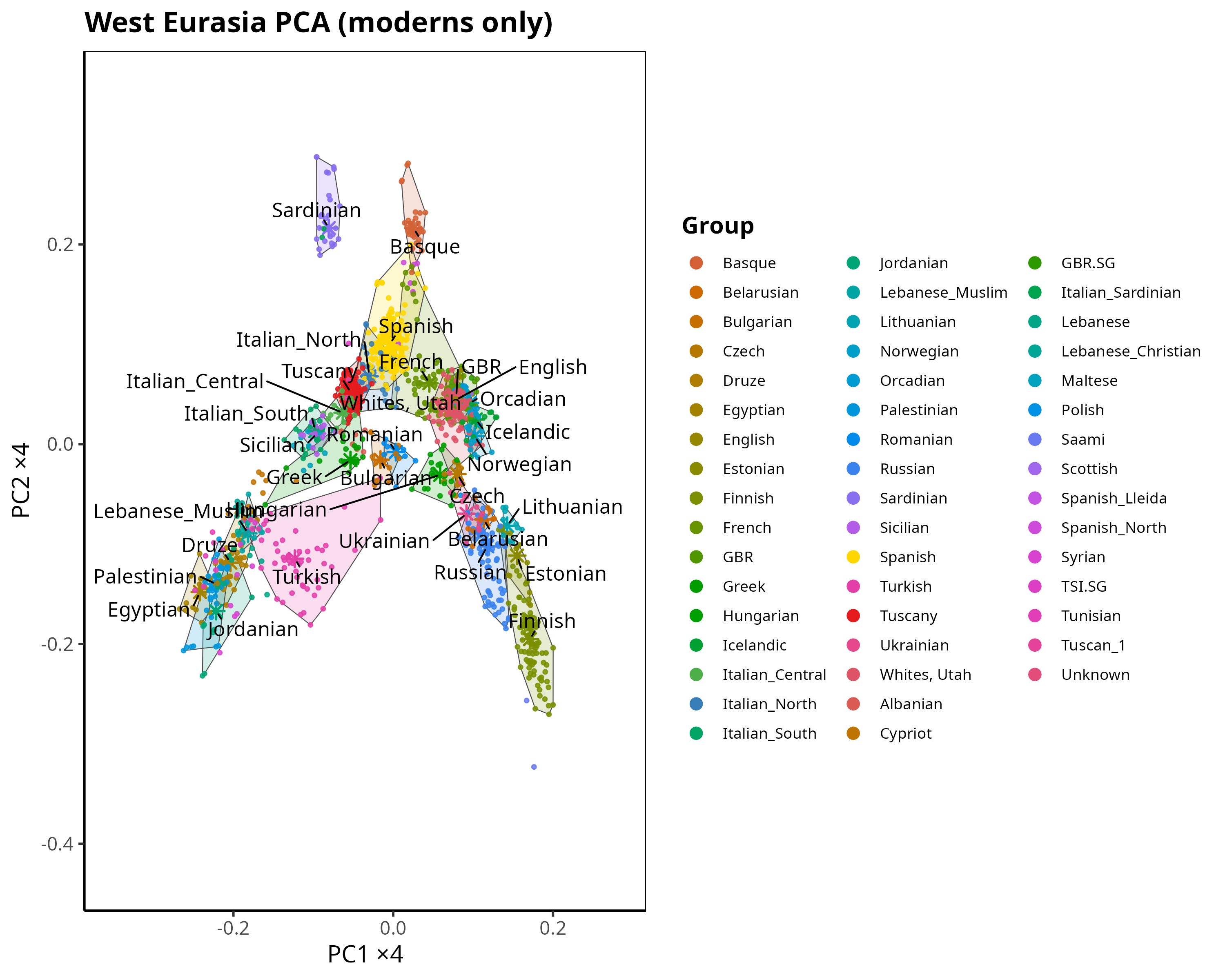
The genetic coordinates look suspiciously like geographic ones.
In this case, populations further to the right (higher values on the X-axis, corresponding to PC1) tend to come from northern latitudes, while those further left tend to be southern. Meanwhile, populations near the top of the plot tend to be more western, and those near the bottom more eastern. This intuition is widely shared and often stated as if it were obvious.
But as far as I know, it has rarely been tested quantitatively.
So I decided to do exactly that: measure how closely genetic space overlaps with geographic space.
From intuition to measurement
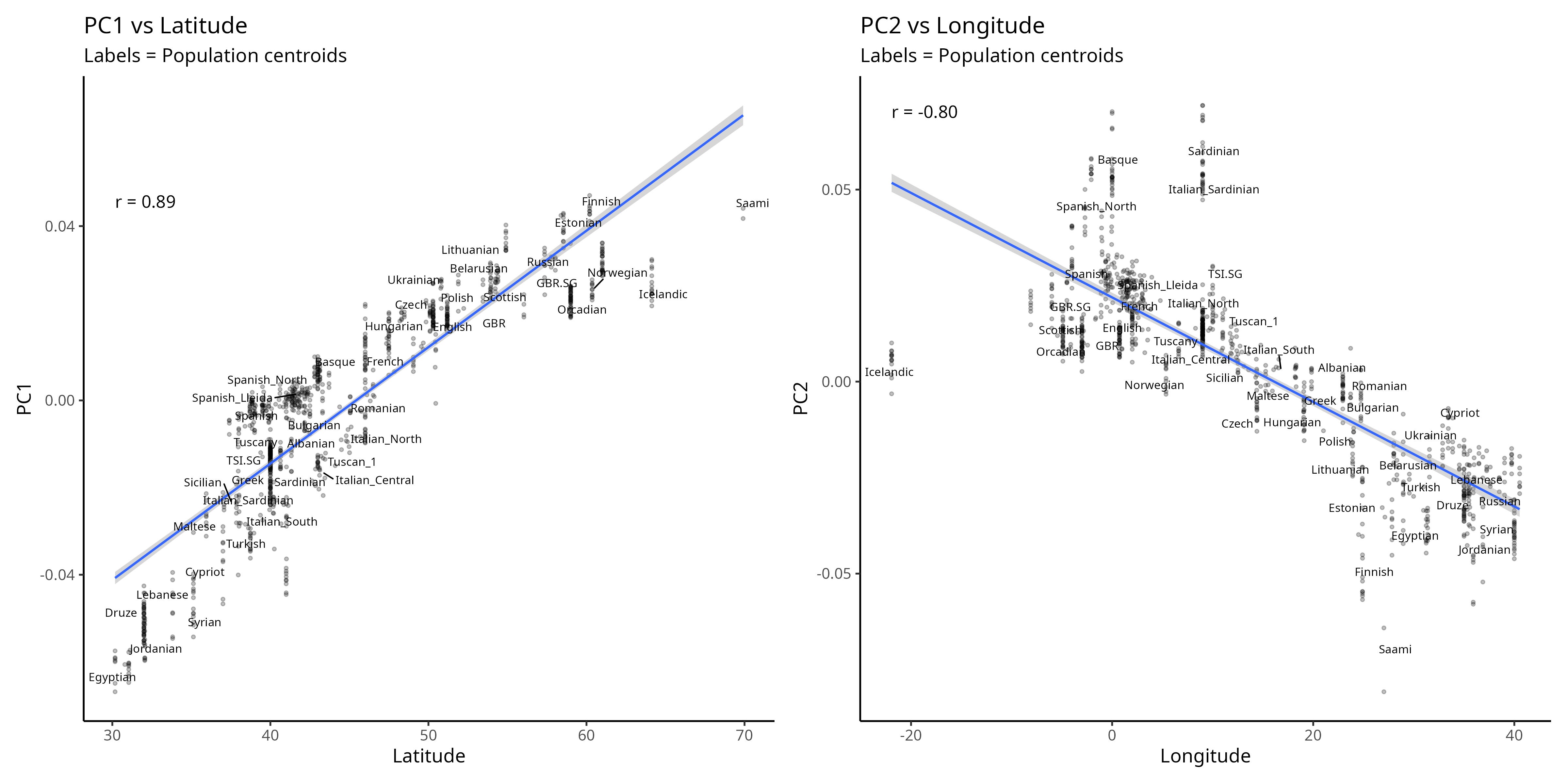
To move beyond visual impressions, I linked PCA coordinates to the actual geographic coordinates of the sampled populations. For each individual, I retained latitude and longitude, and focused on modern samples only. I then asked two simple questions:
How strongly is PC1 correlated with latitude?
How strongly is PC2 correlated with longitude?
At the raw level, the results already confirm the visual intuition: PC1 is strongly associated with north–south position, while PC2 aligns with east–west position. Cross-correlations (PC1 with longitude, PC2 with latitude) are much weaker.
These correlations are visualized in the scatterplots below:
But correlation alone doesn’t tell the full story.
Below the paywall I test the “PCA looks like a map” intuition properly: I fit regression and mixed-effects models that separate north–south from east–west structure, quantify how much of PC1 and PC2 is explained by latitude and longitude, and rank the populations that line up most closely with geography versus those that systematically deviate. I then turn the result into a literal “genetic map” by projecting PCA space onto a European basemap, so you can see where genetics tracks geography and where history bends it.
