
The Three Ingredients of Italian Crime
A data-driven tour of immigration, density, and geography

Is it the mafia? Is it immigrants? Is it the chaotic cities, the empty countryside? Everyone has a pet theory about where Italian crime “really comes from”. I did not choose Italy as a case study because it is uniquely crime-prone, but because it is my home country and because its geography and history make it an unusually good testing ground. Few places combine such a sharp north–south gradient with such variation in culture, economics, and demography. Italy is, in many ways, a natural microcosm for trying out broader sociological hypotheses.
So I pulled the data together and asked a simple question:
Across provinces, how much of the variation in crime can we explain with three things:
how many immigrants live there,
how densely people are packed,
where the province sits on the map (latitude and longitude)?
I did not choose these three variables arbitrarily. Immigration is the most debated factor in public discussions about crime, yet very rarely examined with clean provincial data. It makes sense to start there.
Population density has been linked to conflict and deviance in many strands of the literature, from classical urban sociology to Konrad Lorenz’s observations about crowding and social stress. When many people share a small space, you get more interactions, more anonymity, and more opportunities for both legitimate and illegitimate activity. Whether density drives crime or simply correlates with other urban features, it is a fundamental structural variable that cannot be left out.
Geography, captured here by latitude and longitude, stands in for broader regional patterns that are difficult to quantify directly: the long-run north–south economic divide, institutional differences between regions, and genetic ancestry. If any of these structural elements have an independent imprint on crime, they will appear in the geographic terms once immigration and density are held constant.
There are of course many other plausible predictors one could add, such as income, unemployment, education, administrative capacity, but these tend to overlap heavily with the three broad dimensions above. The point of this analysis is not to build an exhaustive model. It is to see how far we can get with a small set of interpretable, theory-guided variables that capture the major structural forces shaping crime across Italy’s provinces.
The Geography of Crime
I mapped crime across provinces to get a bird’s-eye view of the national pattern.
Each color represents the number of reported crimes per 100 000 inhabitants in 2023.
I measured “crime rate” using the index published by ISTAT called “Delitti denunciati dalle forze di polizia all’autorità giudiziaria (per 100.000 abitanti)”, that is, the number of criminal offenses reported by police and forwarded to the judicial authorities per 100,000 residents in each province. This aggregate includes all kinds of criminal offenses (violent and non-violent, crimes against property, crimes against persons, drug offenses, robberies, thefts, etc.), whether the alleged author is known or unknown, and regardless of whether the crime results in conviction.
Because it bundles a wide variety of crimes, the indicator does not allow us to distinguish between types (for example, petty theft versus violent assault). What it does provide is a broad, comparable measure of recorded crime across all 107 Italian provinces.
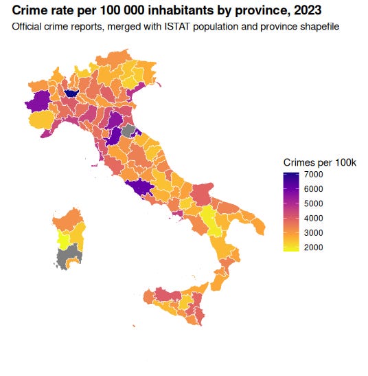
A few patterns jump out immediately:
Northern metropolitan areas and Rome are the darkest spots on the map.
Milan, Turin, Bologna, Rimini, and Florence all show extremely high crime rates. These are the most urbanized provinces in the country, and density alone can push crime upward.The south is not uniformly high-crime.
Calabria and Sicily contain both high-crime and low-crime pockets. Rural areas in the south are often less criminal than northern cities, but large southern cities like Naples, Catania, and Palermo still stand out.The Alps and much of the rural interior are low-crime zones.
Trentino, South Tyrol, Alpine Piedmont, Aosta Valley, parts of Friuli, and several Tuscan and Umbrian provinces appear in the yellow range.
The Data
The dataset is built by merging:
ISTAT population and citizenship counts for 2023
province shapefiles, used to get latitude and longitude
province area, to compute population density
official crime counts by province, converted to crimes per 100 000 residents
I focus on:
% Immigrants = percent of residents with foreign citizenship
log(population density) = log of people per square kilometer
Latitude and Longitude of the provincial centroid
In the second model, I also split immigrants by macro-region of origin (Northwestern Europe, MENA, Sub-Saharan Africa, Eastern Europe, Southeast Asia, etc.), and look at their shares within the immigrant population, not just raw counts.
All models are simple OLS regressions. Continuous variables are centered and scaled when looking at standardized coefficients.
First look: the four scatterplots
Before running regressions models, I plotted four simple scatterplots, one for each predictor:
Crime vs percent immigrants
Crime vs latitude
Crime vs longitude
Crime vs log population density
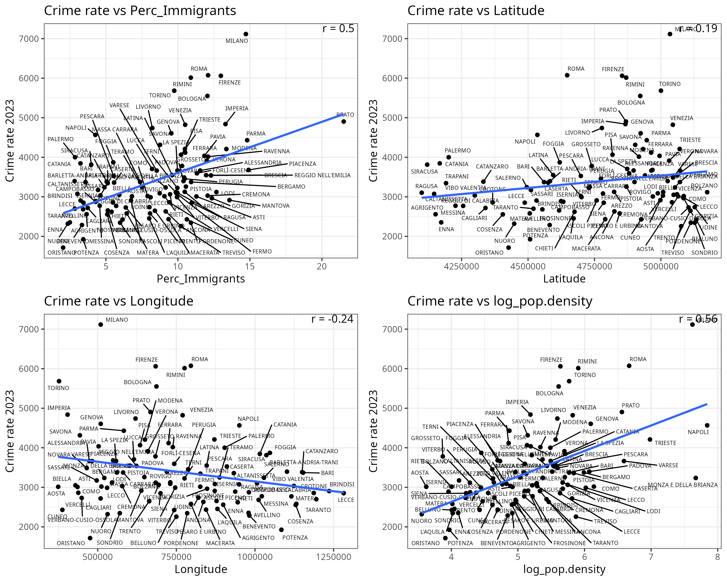
At first glance, crime appears slightly higher in northern provinces.
But this correlation is completely confounded by immigration levels.
Immigration is much higher in the north, and immigration itself is correlated with crime.
The correlation matrix illustrates this nicely:
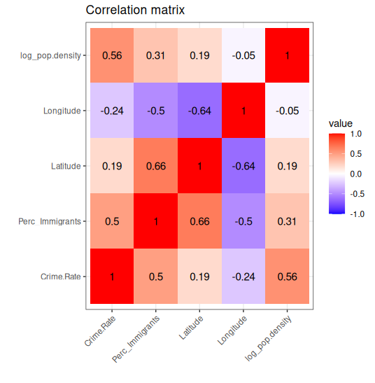
Once we control for immigration and population density, the relationship flips sign:
southern provinces have substantially higher crime, exactly as expected, but this was masked in the raw data by the geographic distribution of immigrants (see regression models below).
Model 1: immigration, density, and geography together
The first regression puts everything into one basket:
Crime rate ~ Perc_Immigrants + Latitude + Longitude + log(population density)
This uses all provinces with complete data (over 100 of them).
The results are shown in Table 1.
Table 1. Regression results for crime rate predicted by immigration share, population density, and geography
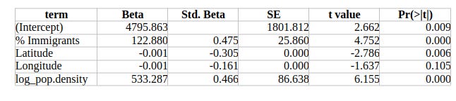
Interpreting the coefficients in real terms
The regression uses crime per 100,000 inhabitants as the dependent variable. Below I translate each coefficient into concrete, intuitive units so that the effects can be compared on the same scale.
Immigrant share
The coefficient for the percentage of immigrants is 122.9, meaning:
For every additional 1 percentage point in the immigrant share, crime increases by about 123 crimes per 100,000 inhabitants, holding all other variables constant.
A difference of 10 percentage points between two provinces (for example, 6% vs 16%) translates into roughly:
+1,229 crimes per 100,000 inhabitants.
This is one of the strongest effects in the model, which is reflected in its standardized beta (0.475).
Population density (log-transformed)
The density coefficient is 533.3, but because it is applied to the logarithm of population density, its effect depends on the size of the density shift.
Some examples make it clearer:
Going from 100 → 400 inhabitants/km²
log(100)=4.61, log(400)=5.99, difference=1.38
Effect: 1.38 × 533.3 ≈ +736 crimes per 100kGoing from 200 → 600 inhabitants/km²
Effect: ≈ +586 crimes per 100k
These magnitudes align with the standardized beta for density (0.466), which places it alongside immigration as one of the major predictors.
However, this association tells us nothing about the direction of causation. We do not know whether densely populated areas attract more criminals, or whether living in dense, urban environments makes people more likely to commit crimes, or whether both are consequences of deeper structural factors (such as economic concentration or policing intensity). Provincial data can show the correlation, but not the mechanism.
Latitude
The raw latitude coefficient is very small (−0.00098), but this is due to the scale of the latitude variable: Italy spans only about 9.5 degrees from south to north.
The standardized effect tells the real story:
The standardized beta for latitude is −0.305, meaning a one standard deviation northward shift is associated with 0.305 SD lower crime, holding immigration and density constant.
Since provincial crime rates have a standard deviation of roughly 900–1000 crimes per 100k, this works out to:
≈ 270–300 fewer crimes per 100,000 inhabitants for a typical northward shift of about three degrees of latitude.
This makes latitude the third strongest predictor in the model, after immigrant share and population density.
Of course, latitude is not acting as a causal force in itself. It is a proxy for deeper variables that are hard to measure directly: differences in historical institutional quality, regional cultural norms, patterns of mafia presence, and genetic ancestry gradients and climate. The model cannot discriminate between these channels. Latitude simply captures whatever north–south structure remains in crime once immigration and density have been factored out.
A concrete example makes the latitude effect easier to grasp. Imagine picking up Milan and sliding it down the peninsula while keeping its density and immigrant share unchanged. If you drop it at Naples’ latitude, the model predicts about 200 extra crimes per 100,000 residents. Push it all the way down to Palermo and the predicted increase jumps to roughly 560 crimes per 100,000. In other words, the north–south gradient is very real, but it is buried under the much larger differences in immigration and urban density visible in the map.
Model 2: does origin composition of immigrants matter?
So far I have treated immigrants as a single block: just “percent foreign citizens”. That raises an obvious follow up question:
Does the mix of origin regions matter, on top of the sheer number of immigrants?
To test this, I build a second model:
The outcome is still crime per 100 000 inhabitants.
Predictors include:
% Immigrants
Latitude
log(population density)
immigrant shares from regions like Northern America, Northwestern Europe, Eastern Europe, MENA, Sub-Saharan Africa, Southeast Asia, and so on
Because shares sum to 100, one region is treated as the baseline (Southern Europe) and omitted from the regression. All other coefficients are interpreted relative to that baseline group.
This second model gives a richer picture. It explains about 56 percent of the variation in crime (adjusted R² ≈ 0.56), so adding composition clearly improves predictive power.
What happens to the main predictors?
% Immigrants is still a strong positive predictor.
log(population density) is still strongly positive.
Latitude is still negative and significant.
So the big structural picture survives even when you let composition enter the game.
Some origin groups show meaningful deviations from the baseline:
A few regions (for example Northwestern Europe, Northern America, Southeast Asia in my specification) are associated with higher crime than the baseline group, holding total immigration, density, and geography constant.
Others are neutral or even slightly negative relative to the baseline.
Table 2. Regression results including immigrant origin composition (scale + composition model)
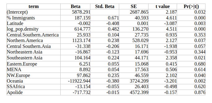
However, the percentage of immigrants in each origin group is very small, which limits statistical power. This is why the group-specific effects hover around marginal significance, while the overall immigrant share shows a much stronger and more stable association (Std. Beta = 0.671).
Conclusion
Stepping back from the coefficients and tables, the picture is surprisingly structured. Once you put just three macro variables into the same model – the share of immigrants, population density, and a simple geographic term for where the province sits on the map – you already account for roughly half of the differences in crime across provinces.
In the subset of provinces where I have detailed composition data for immigrants, the explained variation climbs to about two thirds. However, the work is still done mainly by the big structural levers: the overall immigrant share, population density, and the north–south gradient captured by latitude.
The origin effects are there, but they are fragile. Most immigrant groups make up only a small slice of the local population, so the percentage for each category is tiny and the p values on those coefficients hover just around significance. You can see hints that some groups are associated with slightly higher or lower crime than others, but these signals ride on top of a much louder background: how many people live in a province, how tightly they are packed together, and how large the immigrant population is to begin with.
One final point is worth noting. The north–south cline, which most people assume to be the defining pattern of Italian crime, is not visible in the raw map. It is completely masked by the fact that northern provinces have far more immigrants and denser cities. Once those factors are held constant, the underlying geographic gradient reappears: the negative latitude coefficient shows that northern Italians commit less crime than their southern counterparts.
None of this settles the question of causation. Provincial data can reveal strong structural associations, but they cannot say which direction the arrows run. Untangling those pathways requires longitudinal methods such as cross-lagged panel models, which can test whether changes in immigration, density, or local conditions precede changes in crime (or vice-versa). That is a different project, but this analysis at least maps the terrain on which those causal questions should be asked.
If you want to understand why one Italian province has more crime than another, that is where you look first. And if you want to know where in Italy you should travel to or live, just look at the crime map.
You should use spatial models here.