

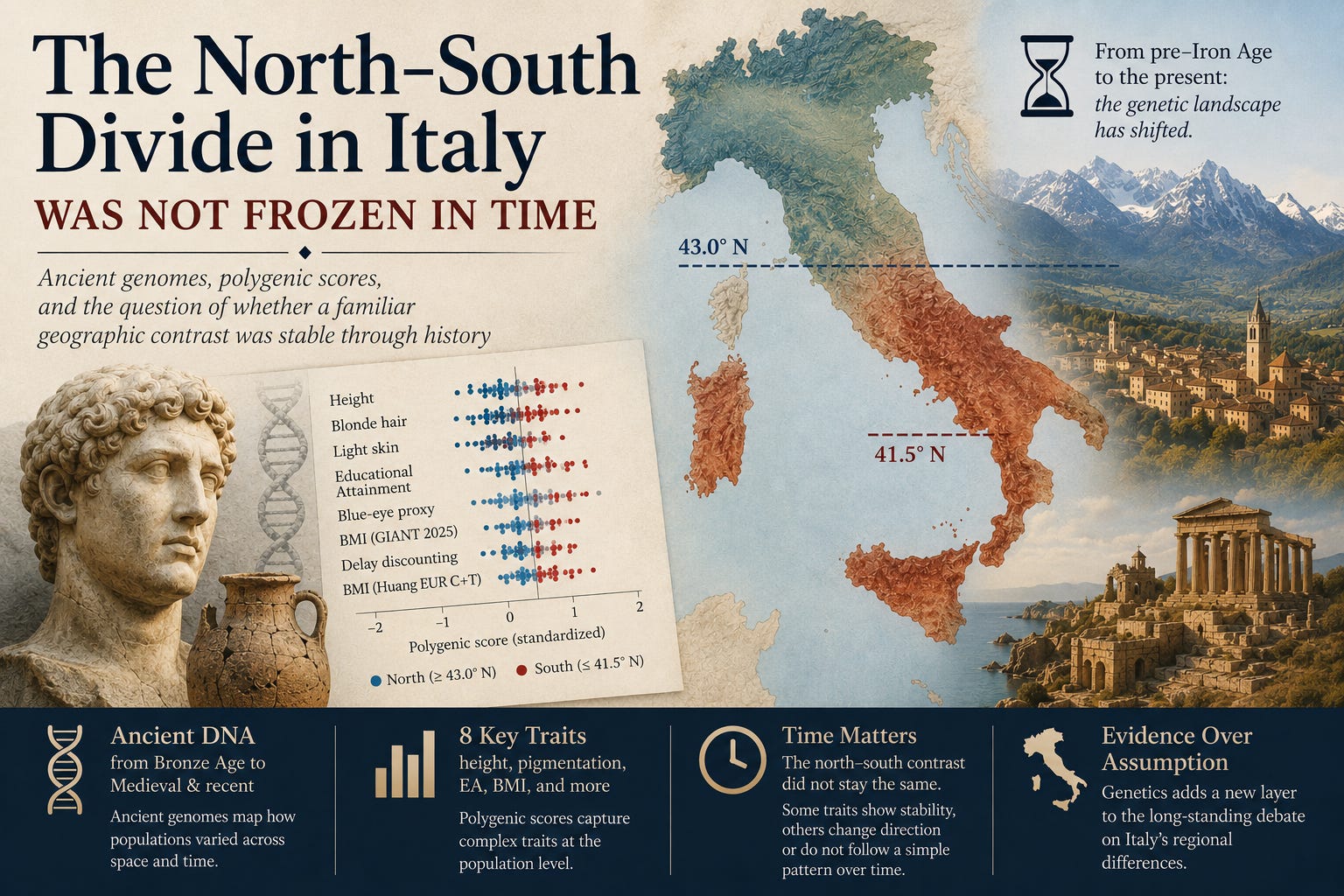
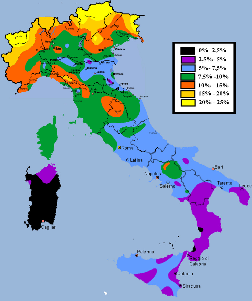
It is easy to view the contrast between northern and southern Italy as a permanent feature of the landscape, a timeless divide separating the Alps and the Po Valley from the Mezzogiorno and the Mediterranean. Many of these physical differences are well known, having been famously mapped by the 19th-century anthropologist Renato Biasutti. His documentation of regional variations, such as the percentage of blonde hair in each province shown in the map below, highlights just how deeply ingrained these geographic contrasts are in our historical understanding.
In economic history, there is a fierce debate over how old the regional gaps in wealth and human capital really are (Pescosolido, Rotondi, and Scoppa 2025; Barbero, Deandrea, and Negri 2021). One influential view sees the North-South divide as having deep pre-unification roots, especially in literacy and human development (Ciccarelli and Weisdorf 2019; Bozzano 2023). A revisionist view, by contrast, argues that the economic gap at unification was small or even absent, and that later state policies helped widen it (Daniele and Malanima 2007, 2011; Federico, Nuvolari, and Vasta 2019).
But this entire debate quietly assumes a baseline that needs to be tested. Was the underlying genetic divergence between the North and South always present in its current form, or did it sharpen, weaken, or shift as Italy transitioned through the Bronze Age, Iron Age, Roman period, and later historic eras?
Ancient DNA (aDNA) allows us to address this question directly, at least from a purely genetic angle. Rather than projecting modern geographic differences backward, we can map ancient individuals, categorize them by region, and track whether polygenic score (PGS) variations show up consistently across different eras.
Specifically, we can look at the very traits that form the core of regional stereotypes, testing whether the data backs up the familiar imagery of shorter, darker southerners compared to taller, more blonde, and more educated northerners. By looking at traits like height, pigmentation, Educational Attainment (EA), and BMI, we can finally ask a concrete question: does the genetic map of Italy look like a fixed, permanent background fact, or did these specific differences emerge, fade, or flip over time?
Pooled North-South Differences
Before investigating how things changed over time, we need a baseline comparison. By collapsing all historical periods together, we can see whether coverage-adjusted, standardized PGS values differ fundamentally between the North and South.
The table reports the South relative to the North using Cohen’s d, meaning negative values indicate that the South exhibits a lower average score than the North.
Table 1. Pooled north-south differences
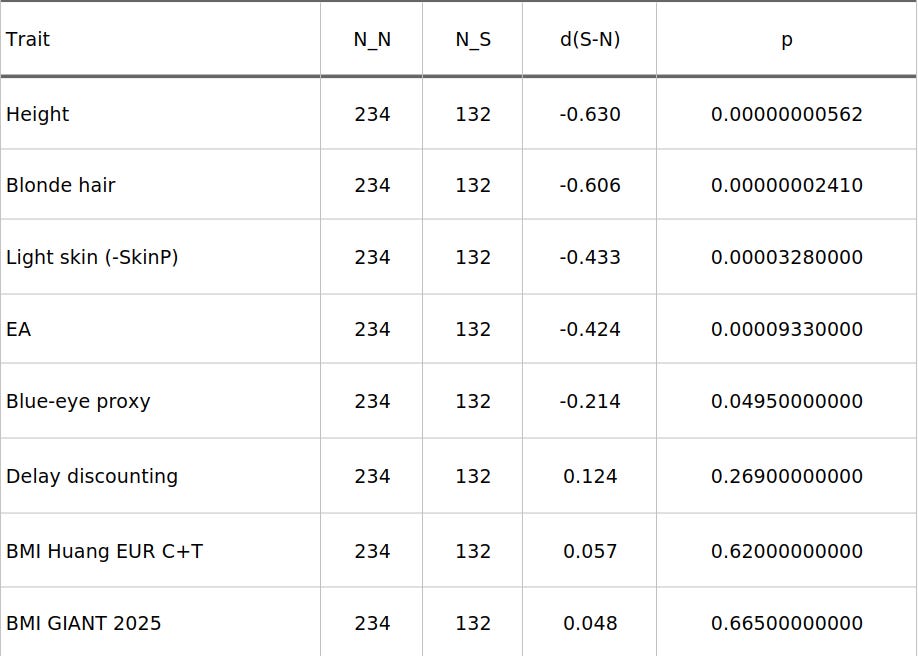
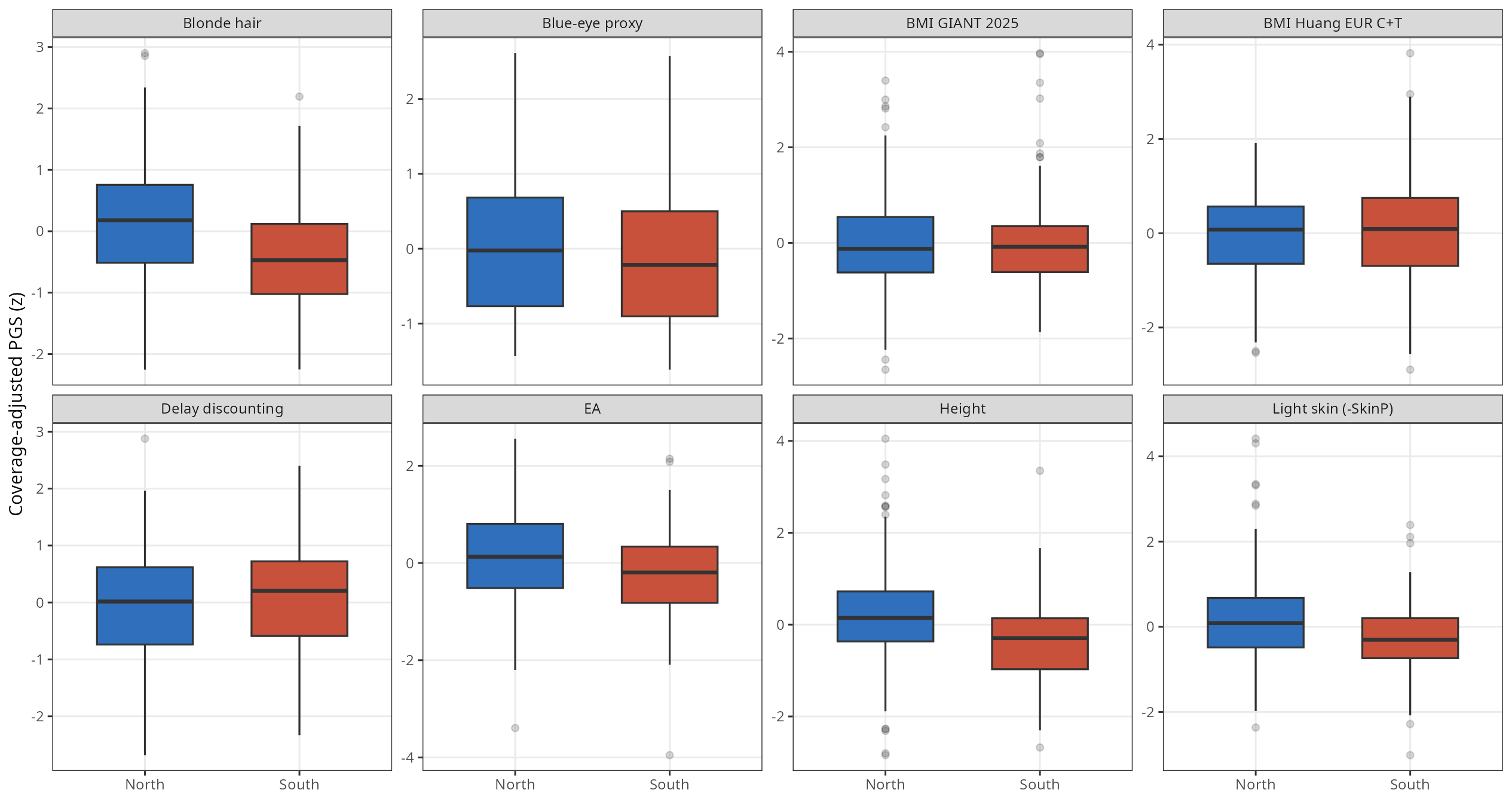
The largest pooled differences are quite straightforward: the South scores lower than the North for height, blonde hair, and light skin. Educational Attainment (EA) is also lower in the South. The proxy for blue eyes leans in the same direction but is only borderline in this pooled layout. Meanwhile, traits like delay discounting and the two BMI variations show no meaningful regional separation when time is ignored
Figure 1. Overall north-south distributions, coverage-adjusted
Tracking the Contrast Through Time
While a pooled comparison gives us a useful overview, it can easily mask historical shifts. A regional contrast might be ancient and stubborn, or it might have started weak and intensified later.
To keep the sample sizes viable for analysis, the data is divided into two broad chronological bins:
Pre-Iron Age and older
A merged Iron Age / Roman / Medieval-to-recent bin
Merging the later periods is a practical necessity; the southern Medieval/recent sample size on its own is simply too small to yield a reliable independent estimate.
Figure 2. Coverage-adjusted period means
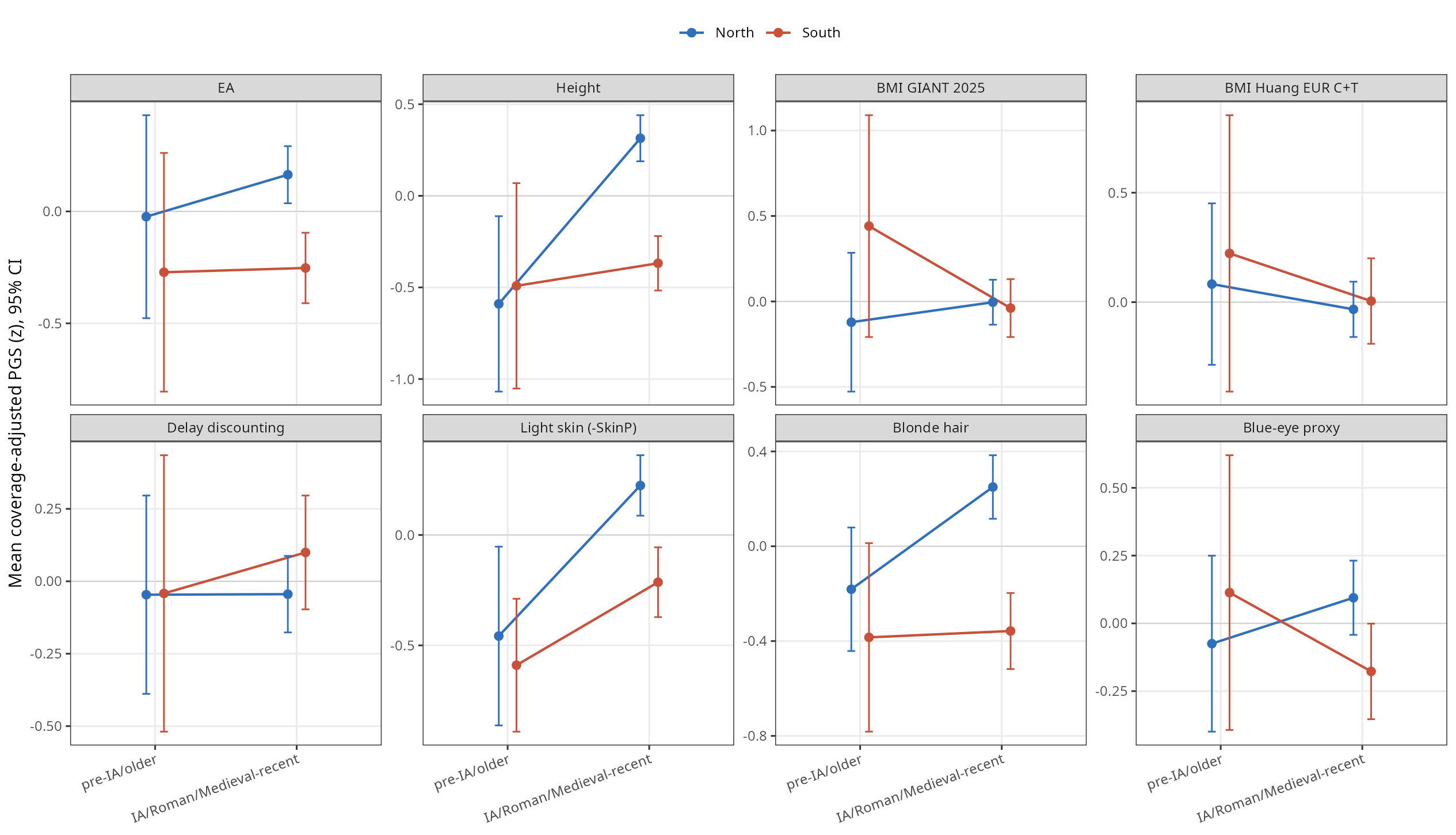
Think of this period plot as a descriptive bridge between the pooled boxplots and a formal interaction model. It maps the mean and baseline uncertainty across broad eras rather than forcing a smooth, continuous time trend. Because the older bin remains relatively sparse, we shouldn’t over-interpret those early-period means. The real takeaway is seeing whether the direction of the contrast remains stable or visibly shifts.
The data reveals that the gaps in Educational Attainment (EA) is remarkably ancient, maintaining a relatively stable trajectory over time. Conversely, the temporal trajectories of Height, Light Skin and Blonde Hair diverged, increasing the gap between North and South in more recent times.
The broad period means in the plot above suggest a shifting landscape, but eye-balling a couple of historical bins isn’t enough. Ancient DNA is notoriously messy, sample sizes fluctuate, and if you want to know whether Italy’s genetic geography was truly fluid, you have to put it to a formal regression test.
When you run the formal interaction model, the results are striking.
To unlock the formal temporal test, and the robustness checks proving this isn’t just data noise, consider becoming a paid subscriber.
Your support directly funds the independent data pipelines and computation time required to pull these historical insights out of raw ancient genomes. Join the community to read the rest of this post and access the full archive.