

The first genetics book I read as a teenager was Cavalli-Sforza, Menozzi and Piazza’s The History and Geography of Human Genes. I remember being stopped in my tracks by its synthetic maps: broad, flowing fields of color in which genetic differences became geography. They made population history feel visible. A migration appeared as a gradient, a boundary, or a meeting of colors, instead of an arrow on a map.
What surprised me later was how rarely I encountered that visual language. Modern population-genetics papers are full of PCA scatterplots, ancestry bars, and formal mixture models. Those are powerful tools and usually more explicit about uncertainty. Yet the red-green-blue maps that first captured my imagination seem to have all but disappeared from scientific articles and genetics blogs.
So I decided to reproduce the idea for Italy. The country is almost designed for such an experiment: a long north-south peninsula, two large islands, mountain barriers, and a position at the junction of continental Europe and the Mediterranean. Its history contains repeated movements of farmers, pastoralists, merchants, soldiers, enslaved people, colonists and refugees. If genetic geography can be painted anywhere, Italy should leave a vivid canvas.
Alongside this article, I am launching pca.davidepiffer.com, a growing interactive atlas of genetic geography. Italy is the first detailed entry, and a Europe-wide map provides the broader continental view. Readers can move between analyses, zoom into regions, inspect the geographic anchors beneath each map, and switch between the RGB composite and its constituent principal components.
The atlas is designed to grow across countries, regions and continents. Because a world PCA, a continental PCA and a country-scale PCA reveal different levels of structure, the site keeps them as separate coordinate systems. It identifies the reference panel, scaling and interpolation used for every map. The colors are therefore tools for exploration, not ancestry percentages, and each analysis includes downloadable figures, locality data and validation notes.
How the RGB maps were created
I used a principal-component analysis built from 918 unrelated comparison individuals: 690 Europeans and 228 people from Middle Eastern or Caucasus reference populations. The model used 3,113 shared autosomal SNPs. We held out all 348 Italian targets while fitting the axes, then projected them into that fixed coordinate system, so the Italian samples did not rotate the map around themselves.
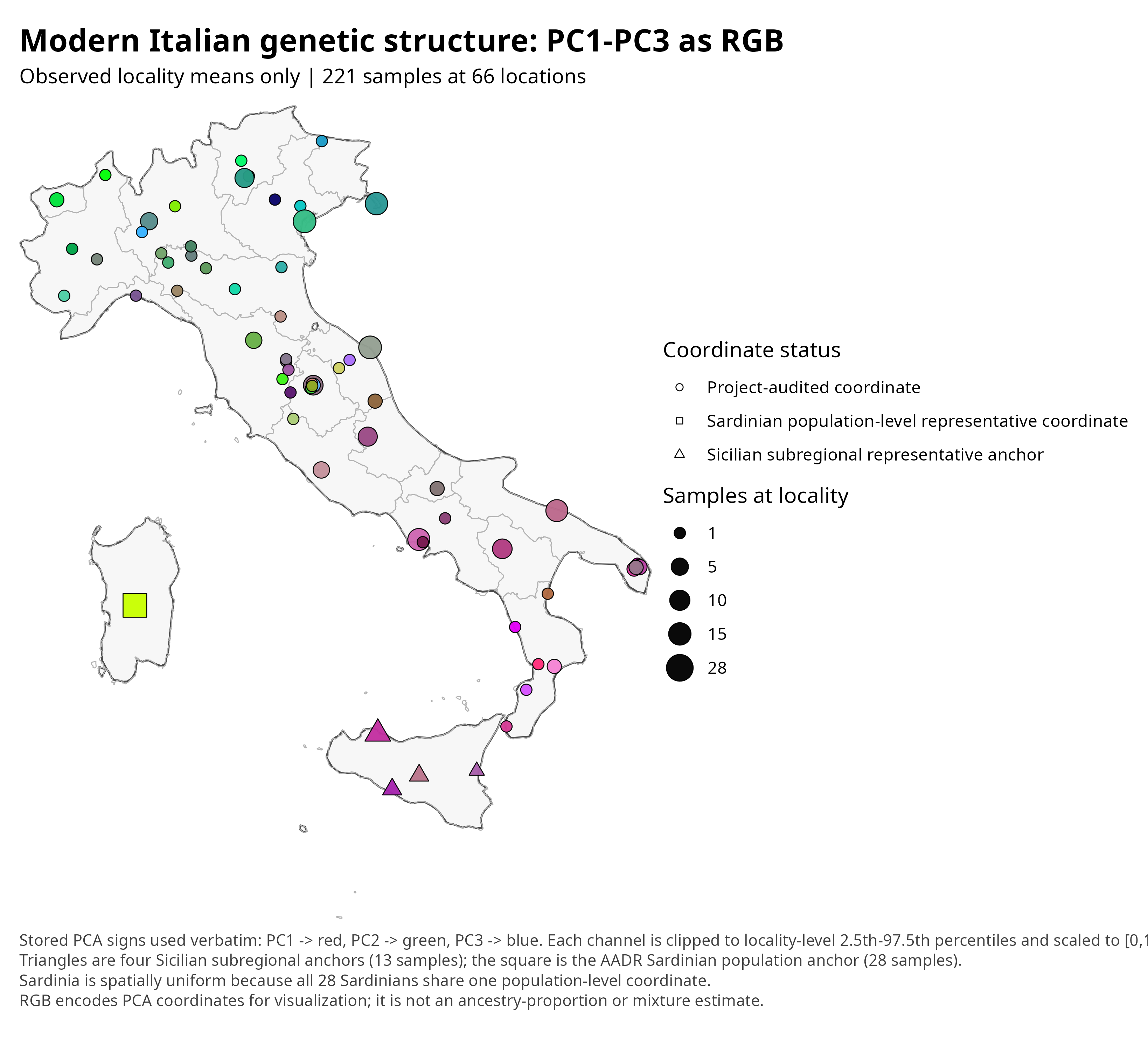
Of the 348 projected Italian targets, 193 could be assigned to defensible geographic anchors: 129 using regional-capital coordinates under the published Raveane rule, 51 using individual sampling localities, and 13 Sicilians using four disclosed subregional representative anchors. The other 155 targets had only broad population or regional labels and were excluded from the spatial interpolation, although they remained in the PCA. I also mapped 28 Sardinian fitting references at one population-level anchor. The final map therefore represents 221 individuals—193 projected targets and 28 Sardinian references—at 66 geographic anchors. I averaged people assigned to the same locality before interpolation, preventing a heavily sampled city from exerting more spatial pull simply because it contributed more individuals. PC1 became red, PC2 green, and PC3 blue. Each channel was clipped at the 2.5th and 97.5th percentiles of the locality means and rescaled from zero to one.
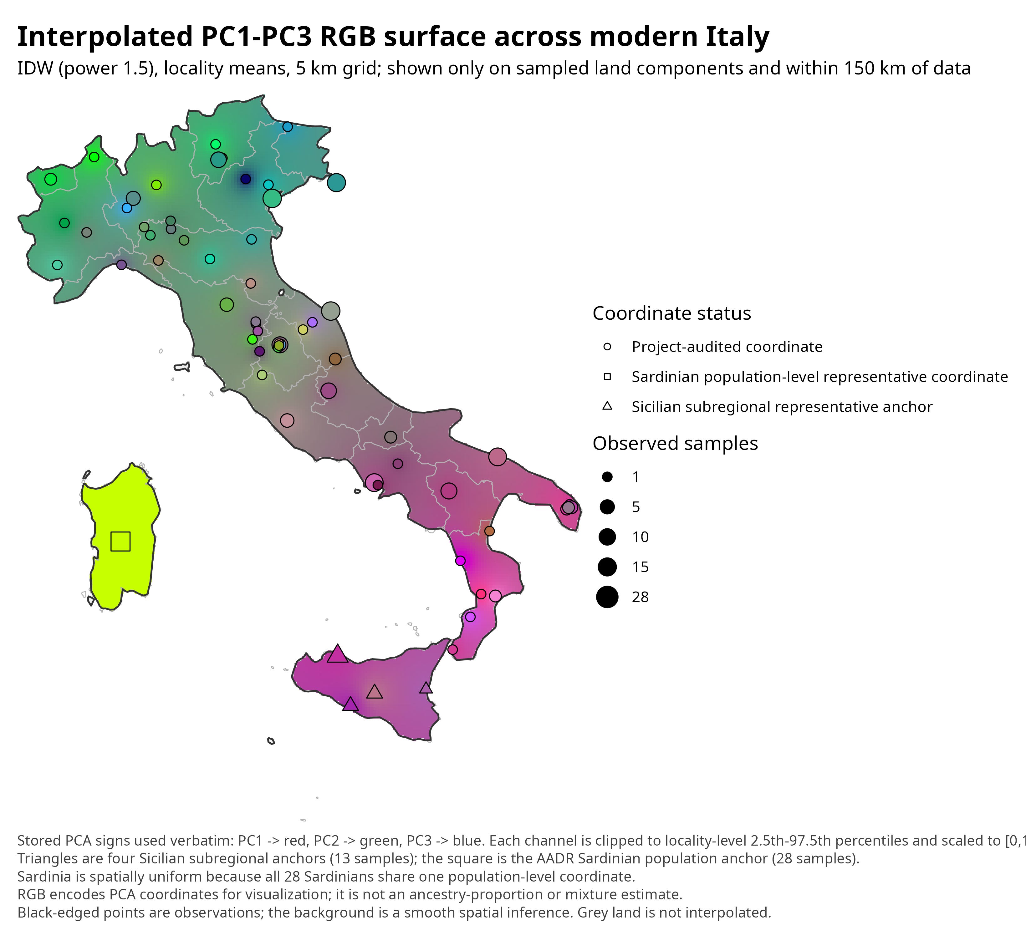
The first map shows only the observed locality means. The continuous map uses inverse-distance weighting on a five-kilometre grid. The interpolation was limited to the same landmass as an observed point and to a maximum of 150 kilometres from the data. That keeps the sea from becoming an imaginary genetic bridge and leaves unsupported land grey. Full technical details appear in the appendix.
Results: a genetic landscape, not a genetic checkerboard
The observed localities already reveal the main result. Nearby places often have related hues, but not identical ones, and the peninsula changes progressively rather than breaking into neat blocks (see Figure 1). The broad geographic signal is measurable: across all pairs of localities, geographic distance and RGB distance have a Spearman correlation of 0.403. The median color distance is 0.255 for pairs within 100 kilometres and 0.349 for pairs separated by more than 300 kilometres.
That is strong enough to make geography visible, but weak enough to preserve surprise. The Alps, the Apennines, coastlines, islands, historic roads and uneven sampling all matter. So do drift and the fact that two people from one town need not have identical family histories. The point map is the honest foundation: it shows what was observed before a smooth surface encourages the eye to invent continuity.
Figure 1. From genotypes to colors: observed locality means.
The peninsula as a cline
When the locality means are interpolated, the peninsula resolves into a broad transition from greener and teal shades in much of the north to mauve, magenta and purple shades in the south (Figure 2). Central Italy is not a hard dividing line. It is a zone of overlap in which the two dominant gradients meet, with local deviations layered on top.
This north-south pattern agrees with earlier genome-wide studies of Italy and with the wider European observation that genetic variation often mirrors geography (Novembre et al., 2008; Raveane et al., 2019). But a cline is not a migrating population frozen in place. It is the accumulated covariance produced by many episodes of movement, mating, and isolation. The smooth background should therefore be read as a hypothesis about spatial continuity between observations, not as measured DNA at every pixel.
Figure 2. A smoothed RGB surface across modern Italy.
What each color channel contributes
The RGB map becomes easier to interpret when its channels are separated. These single-component maps do not reveal three pure ancestries. They show three perpendicular statistical directions chosen by this particular reference panel. Changing the panel or marker set can rotate the axes, especially beyond the strongest geographic direction.
PC1: the strongest peninsular gradient
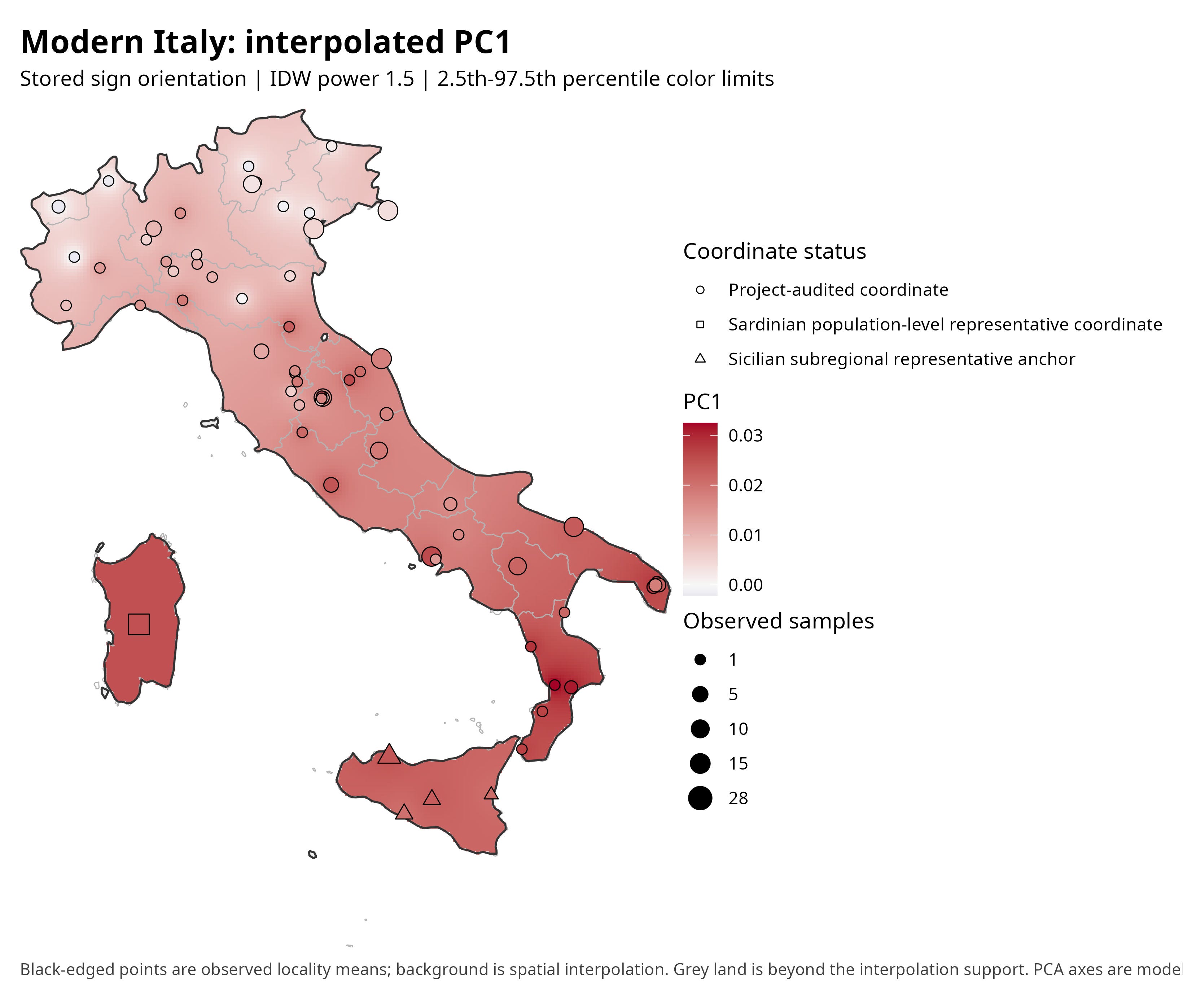
PC1 increases strongly toward the south and east of the peninsula (Figure 3). At the locality level, its Spearman correlation with latitude is -0.815 (-0.822 when Sardinia and Sicily are excluded). In the wider reference panel, the positive end of this axis points toward the eastern and southern Mediterranean side of West Eurasian variation, while the negative end points toward northern and northeastern Europe.
That orientation makes the Italian pattern historically suggestive. Southern Italy and Sicily have repeatedly received gene flow through Aegean, Balkan, Anatolian and wider Mediterranean connections, while northern Italy has had stronger continental links across the Alps and the Po basin. Yet PC1 cannot tell us whether a given shift came from Neolithic farmers, Bronze Age movements, Greek colonization, Roman mobility or later migrations. Several processes can move populations in the same direction in PCA space.
Figure 3. PC1: a pronounced north-south and west-east gradient.
PC2: Sardinia and the western side of the map
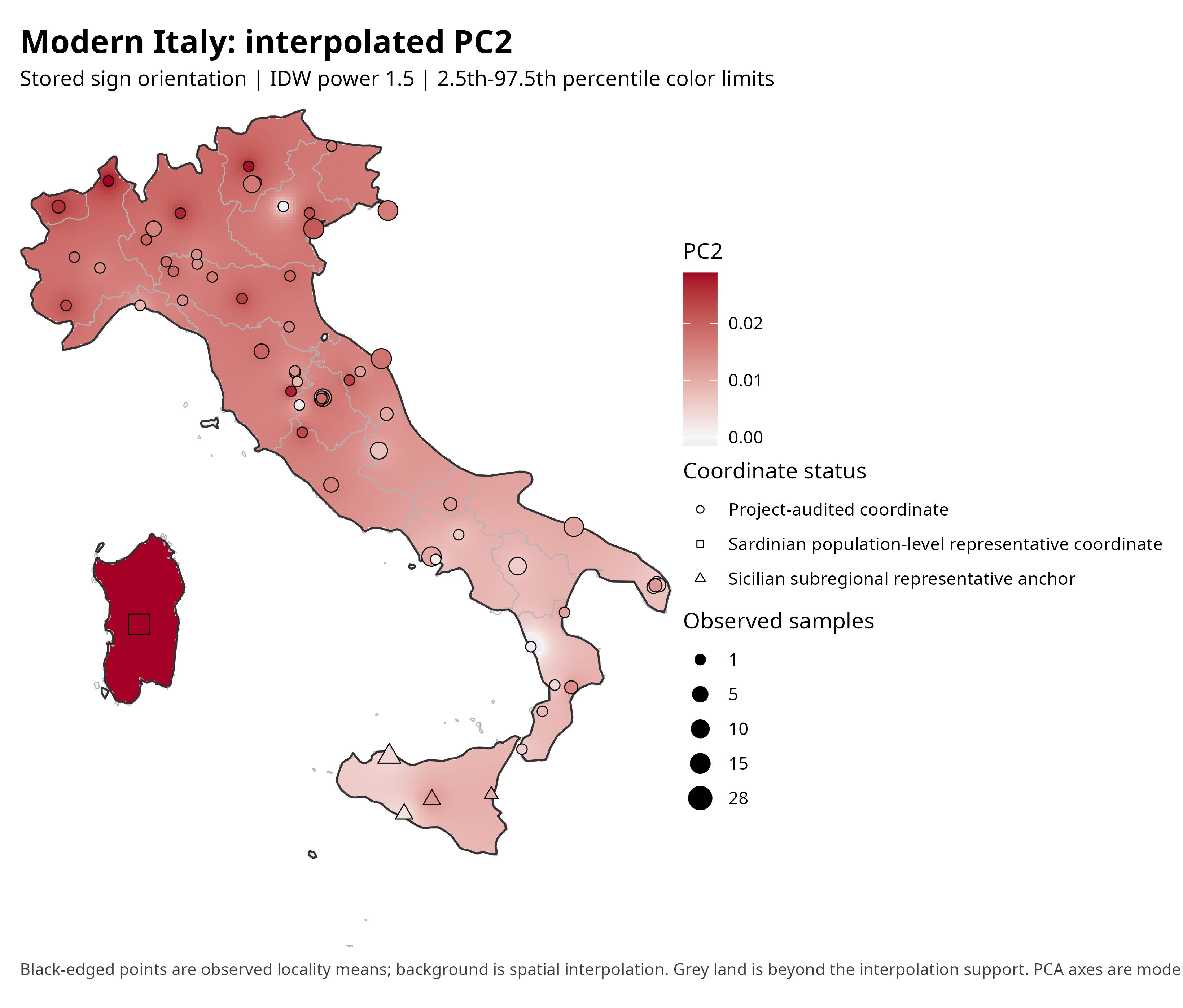
PC2 supplies much of the green channel in the composite (Figure 4). It tends to be higher in the north and west and lower toward the south and east. Sardinia is the conspicuous extreme: its reference centroid has the highest PC2 value in this comparison panel, ahead of Basques, Balearic Islanders and Corsicans.
This is where ancestry history and drift become inseparable. Ancient DNA shows that Sardinia retained unusually high affinity to early western Mediterranean farmers and experienced long periods of relative isolation, followed by later Mediterranean gene flow (Chiang et al., 2018; Marcus et al., 2020). Isolation also magnified random allele-frequency change. In PCA, such drift can pull an island population away from a mainland cline even when the underlying ancestry is not exotic. The bright Sardinian color is therefore not a single migration signal; it is a composite of ancestry retention, later contacts, and drift.
Figure 4. PC2: a western-insular and north-south contrast.
PC3: local texture and a warning against overstory
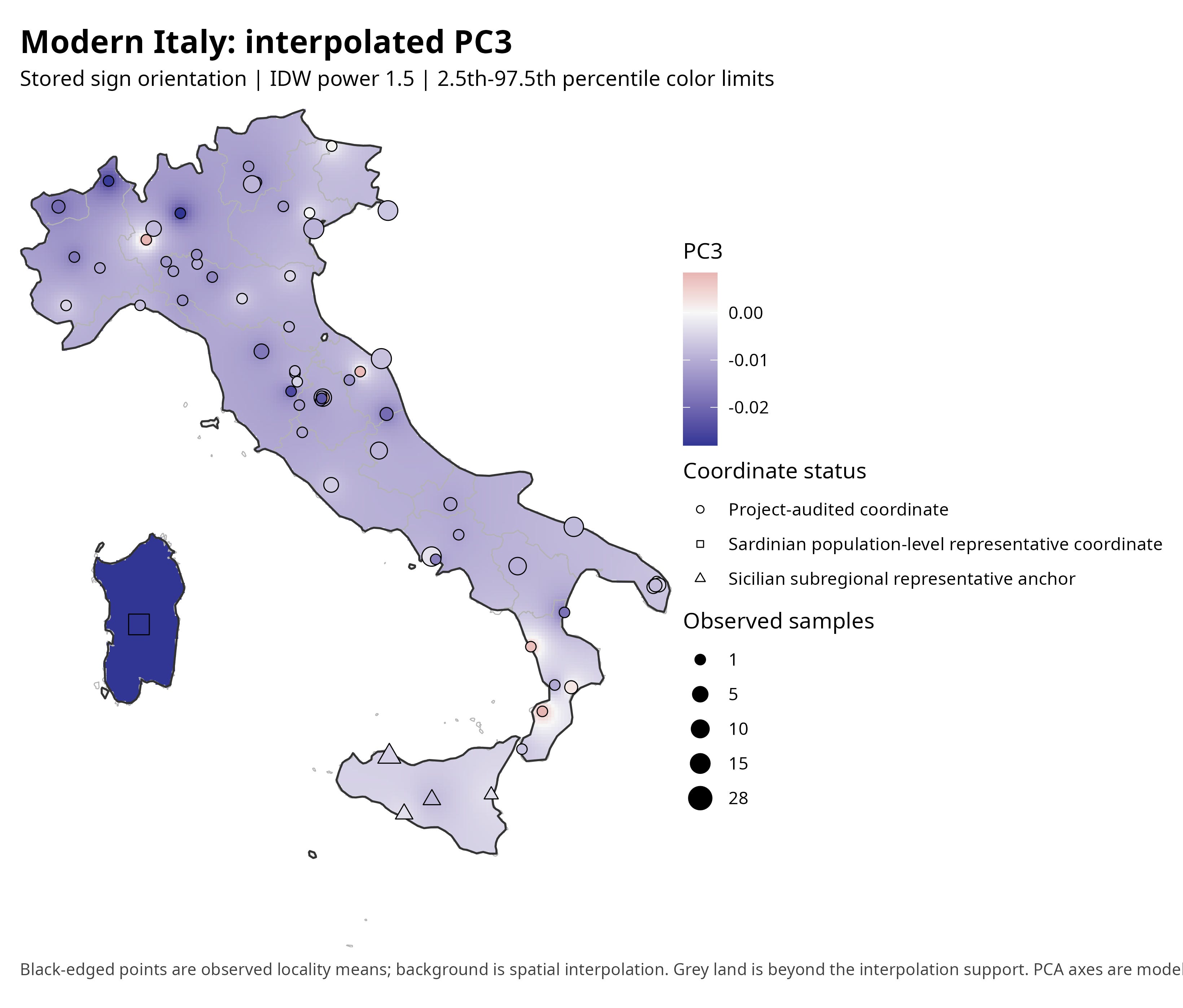
PC3 adds the blue channel and is much less tightly aligned with latitude (Spearman rho = -0.248; Figure 5). It separates Sardinia strongly from the peninsula and contributes smaller patches of contrast within mainland Italy. In the wider panel, this axis distinguishes western and insular populations at one end from parts of eastern and northeastern Europe at the other.
Because the third component is weaker and more panel-dependent, it is tempting to turn every local patch into a story. That would be a mistake. Some texture may reflect real regional drift, mountain-valley isolation or historically localized gene flow; some may reflect sparse local sampling or the averaging of people at a coordinate. PC3 is most useful here as a reminder that Italy is not explained by a single north-south axis.
Figure 5. PC3: island separation and finer regional texture.
What migrations could have painted this landscape?
The safest historical reading begins with layers rather than labels. Present-day Italians, like other Europeans, descend in varying proportions from hunter-gatherers, early farmers ultimately connected to Anatolia, and later groups carrying steppe-related ancestry. Italy received those transformations unevenly. Maritime Neolithic routes, Alpine and Adriatic corridors, and different Bronze Age contacts left gradients that later populations inherited.
The southward PC1 shift is compatible with stronger affinities to southeastern Europe and the eastern Mediterranean documented in modern and ancient-DNA studies. That broad affinity may contain several chronologically distinct processes: Neolithic settlement, post-Neolithic movements related to the Aegean and Caucasus, Greek and other colonial networks, and the intense mobility of the Roman world. Ancient genomes from Rome show that the city became a genetic crossroads with substantial Mediterranean diversity; later central Italian transects show further transformation after antiquity (Antonio et al., 2019; Posth et al., 2021). None of these episodes owns a color channel, but together they provide plausible historical mechanisms for the direction of the cline.
Northern Italy’s cooler green-teal region is likewise not simply ‘more northern European.’ The Po Valley is a corridor as well as a boundary zone, and the Alps are crossed as well as isolating. Continental affinities can reflect Bronze Age and later movements from central Europe, while local Alpine and Apennine communities may acquire distinctive signals through endogamy and drift. A smooth continental gradient and sharp microregional differentiation can coexist.
Sardinia demonstrates why drift matters. A population can become genetically distinctive without a dramatic replacement: long-term small effective population size and reduced gene flow allow chance changes in allele frequencies to accumulate. Sicily illustrates the complementary process. Its position in the central Mediterranean made it repeatedly connected, so its colors are more naturally read as layered gene flow than as isolation alone. The two islands are both distinct, but for different demographic reasons.
What the colors say
Cavalli-Sforza’s great visual insight was that human genetic variation has a geography. When the major dimensions of genetic variation are turned into colors, Italy does not break neatly into regional blocks. Instead, gradients run across the peninsula, interrupted by islands and more isolated populations.
That pattern makes historical sense. Italy has always been both a corridor and a patchwork of local worlds. People moved along coasts, valleys and plains, while mountains and distance slowed movement and isolation allowed some communities to drift apart. Ports and cities repeatedly brought in people from elsewhere. The result is not a mosaic with hard borders but a landscape in which genetic similarity changes gradually across space, with a few conspicuous exceptions.
When I first saw Cavalli-Sforza’s maps as a teenager, I thought of them almost as maps of the past. Recreating them now, I see them somewhat differently. They are maps of relationships among people living today, but those relationships are themselves the product of history. Geography shaped who mixed with whom, migrations altered the gradients, and isolation preserved or exaggerated local differences. The RGB map compresses all of that into three colors.
It cannot tell us when those differences arose or which migrations produced them. For that we now have ancient DNA and explicit demographic models. But as a way of seeing the genetic geography of Italy at a glance, Cavalli-Sforza’s idea remains remarkably effective.
Technical appendix
PCA model and projection
The RGB figures use the fully held-out Europe plus Middle East/Caucasus sensitivity PCA because it contains PC1 through PC20 for the same 348 Italian targets. The fit comprised 690 unrelated European and 228 unrelated Middle Eastern/Caucasus references at 3,113 shared SNPs. Italian targets were projected after fitting. This differs from the later 20-replicate consensus export, which used 42,242 SNPs but retained only PC1 and PC2; a three-channel RGB map requires PC3.
Geographic units and special anchors
The mapping unit is the mean PCA coordinate at each distinct audited latitude-longitude pair. Of the 348 projected Italian targets, 193 were mappable at 65 target localities: 129 were assigned regional-capital coordinates under the published Raveane rule, 51 had individual sampling localities, and 13 Sicilians were assigned to four disclosed subregional representative anchors. The remaining 155 targets had only broad population or regional labels; they remained in the PCA but were excluded from spatial interpolation rather than being assigned invented point coordinates. The map also includes 28 Sardinian fitting references at one additional anchor, producing a total of 221 individuals at 66 geographic anchors. The Sicilian targets have source-defined western, central, eastern and southern labels but no individual coordinates; they are placed at representative anchors in Palermo, Caltanissetta, Catania and Agrigento. The Sardinians are not members of the 348-target export and all share the AADR/HGDP population coordinate 40° N, 9° E. Consequently, Sardinia is shown as one spatially uniform anchor and cannot reveal within-island structure.
RGB encoding
Stored PC signs were used verbatim: PC1 to red, PC2 to green and PC3 to blue. No manual sign flip was chosen to make the map resemble geography. For each component, locality means below the 2.5th percentile were clipped to zero, values above the 97.5th percentile were clipped to one, and intermediate values were linearly rescaled. This robust scaling improves contrast but means that RGB distances are visual distances within this map, not distances in the original PCA units.
Interpolation and validation
Inverse-distance weighting was applied separately to PC1, PC2 and PC3. Candidate powers 1.5 and 2.0 were compared by leave-one-locality-out prediction; 1.5 had the lower mean standardized RMSE across the three components. The surface uses a 5 km grid, is masked to Italian land, never crosses between disconnected land polygons, and is suppressed more than 150 km from the nearest observation. The realized maximum distance was 137.4 km. The relationship between geographic and RGB distance was moderate rather than deterministic (Spearman rho = 0.403).
Limits
The reference panel determines the PCA axes, and a different scope or marker set can rotate them. Geographic coordinates vary in precision; several are regional or population anchors rather than individual sampling locations. Interpolation creates visually plausible values where no genome was measured. Sample density is uneven. PCA itself is descriptive: historical claims require ancient DNA, explicit admixture models, dates and sensitivity analyses. For those reasons the interpretations above are hypotheses consistent with the maps and prior research, not causal assignments of a color to a migration.
References and further reading
Cavalli-Sforza, L.L., Menozzi, P. & Piazza, A. (1994). The History and Geography of Human Genes. Princeton University Press.
Novembre, J., Johnson, T., Bryc, K. et al. (2008). Genes mirror geography within Europe. Nature 456, 98-101.
Di Gaetano, C., Voglino, F., Guarrera, S. et al. (2012). An overview of the genetic structure within the Italian population from genome-wide data. PLOS ONE 7, e43759.
Fiorito, G., Di Gaetano, C., Guarrera, S. et al. (2016). The Italian genome reflects the history of Europe and the Mediterranean basin. European Journal of Human Genetics 24, 1056-1062.
Raveane, A., Aneli, S., Montinaro, F. et al. (2019). Population structure of modern-day Italians reveals patterns of ancient and archaic ancestries in Southern Europe. Science Advances 5, eaaw3492.
Chiang, C.W.K., Marcus, J.H., Sidore, C. et al. (2018). Genomic history of the Sardinian population. Nature Genetics 50, 1426-1434.
Marcus, J.H., Posth, C., Ringbauer, H. et al. (2020). Genetic history from the Middle Neolithic to present on the Mediterranean island of Sardinia. Nature Communications 11, 939.
Antonio, M.L., Gao, Z., Moots, H.M. et al. (2019). Ancient Rome: A genetic crossroads of Europe and the Mediterranean. Science 366, 708-714.
Posth, C., Zaro, V., Spyrou, M.A. et al. (2021). The origin and legacy of the Etruscans through a 2000-year archeogenomic time transect. Science Advances 7, eabi7673.
Page