
Racial Cosplaying in DNA Space: My New App Feature Reveals How We All Play Genetic Dress-Up

I've just added what might be my most provocative feature yet to my Population Genetics Explorer app, and I'm calling it "racial cosplaying in DNA space." It sounds playful, but it reveals something profound about how we construct and reconstruct racial categories based on genetic data.
Subscribe free to get weekly insights that don’t make it into mainstream coverage. Paid members unlock deep dives + exclusive apps for exploring the data yourself.
What Is "Racial Cosplaying in DNA Space"?
we all have ideas about "racial groups" and who belongs to them. But when you look at actual genetic data, these categories start to blur in fascinating ways. My new Superpopulations feature lets you watch this happen in real time.
By adjusting a simple slider that controls how genetically similar populations need to be to cluster together, you can essentially "try on" different racial classifications and see how they look from a genetic perspective. It's like a costume party where populations change outfits based on your criteria.
How It Works
Using hierarchical clustering with complete linkage, my app groups populations into clusters where the maximum genetic distance (Fst) between any two populations in a cluster never exceeds your selected threshold.
To see racial cosplaying in action:
Go to the "Superpopulations" tab
Adjust the Fst threshold slider
Click "Update Clusters"
Watch as populations change their "racial outfits" before your eyes
The Magic of Different Thresholds
What's fascinating is how the clusters change as you adjust the threshold:
At a low threshold (0.01-0.04): You see many small, tight clusters. If you belong to the stricter kind, this threshold might suit you best. Europeans are separated from Middle Easterners, and Siberians form their own cluster distinct from East Asians (Chinese, Japanese, etc.).
At a medium threshold (0.04-0.1): Now you're seeing regional clusters. This is where things get interesting - populations that we might consider racially distinct start clustering together based on geographic proximity rather than our social categories. For example, at a distance of 0.05, Middle Easterners such as Turkish, Palestinians, Druze, Iranians etc. are grouped together with Europeans.
Siberians, Central Asians and East Asians form separate clusters (n.2, 4,5).
Are you happy with this clustering?
At a high threshold (>0.1): Suddenly you're looking at continental-scale clusters. This is where our traditional racial categories start to emerge, but with surprises! You might find that some populations we think of as distinct are genetically closer than we assumed, while others we group together are actually quite different genetically.
Amazingly, East Asians and Siberian/Arctic populations “refuse” being grouped together, suggesting they represent genuinely distinct groups. Here is the output for groups using a threshold of Fst<0.1.
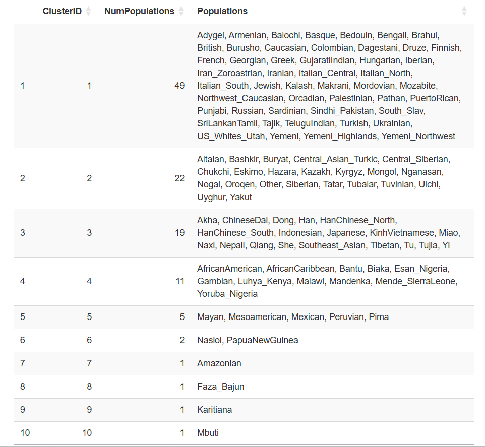
You may also have noticed that there are some lone wolves, such as Amazonians, Karitiana and Mbuti. These groups due to small population size and isolation have experienced strong population bottlenecks followed by genetic drift, making them very different even from populations in the same country or continent. The Mbuti are a Central African rainforest hunter-gatherer (CRHG) population, similar to the Hadza and the Sandawe, which are thought to have diverged from the ancestors of Bantu agriculturalists in Central Africa as early as 70,000 years ago. They are known as Pygmies for their particularly short stature.
The Papuans also form their own group, and I have written about them in a recent post.
You are welcome to share your impressions in the comments.
The Surprises I've Found
Playing with this feature has revealed some fascinating patterns:
The "Who's Really Related?" Game: Some populations that look phenotypically similar are genetically distant, while others that look different are genetically close. It's a reminder that race is more than skin deep. On the other hand, populations that share some features can be extremely different. For example, Papuans and Africans have both very dark skin and large nostrils, curly hair, etc. but they are among the most distant populations on Earth. This is due to local adaptation shifiting allele frequencies at quantitative traits, or at single loci (for Mendelian traits) and forms the basis for the distinction between Qst (phenotypic difference due to additive genetic variance) and Fst. As I have shown before, Fst is a measure of neutral genetic differentiation, but it is not a good measure of phenotypic differentiation.
Geographic Proximity Trumps Racial Categories: Often, populations cluster based on geographic proximity rather than our social constructs of race. Neighboring populations have mixed and shared genes throughout history, creating genetic continuity across racial boundaries.
Why This Matters
This feature isn't just a technical curiosity - it challenges how we think about human difference. By visualizing how racial categories shift and change based on genetic similarity thresholds, we can see that:
Genetic diversity exists on a continuum, not in discrete boxes
Human populations have been mixing and sharing genes throughout history
Our social categories often don't align with genetic reality
We use different “standards” or genetic distance thresholds when we group populations together.
Try It Yourself
I've restricted this feature to the premium version of my app, available only to paid Substack subscribers, due to data usage limits on shinyapps.io.
Become a paid subscriber now for full access to all 113 populations
What Will You Discover?
I encourage you to play with this feature and see what surprises you find. Try different thresholds and watch how populations change their genetic "costumes." Ask yourself:
Which populations cluster together that surprise you?
How do traditional racial categories hold up under genetic scrutiny?
What does this tell us about human history and migration?
The link to the app is available below.
