
Finding a nation’s “Urheimat” with population-genetic tools

In a previous post, Genetic space and geographic space: how similar are they, really?, I showed that in Western Eurasia there is a surprisingly tight relationship between geography and genetics: the main principal components computed from genome-wide data track latitude and longitude well enough that Europe can be “redrawn” from DNA alone. The visually striking part was a small magician’s trick: take genetic coordinates, learn the best alignment to geographic coordinates, and project the genetic map back onto a real one. Most populations land close to home, but a few are pushed conspicuously away from where they currently live.
“Urheimat” in this post is therefore a metaphor, not a claim about literal origins. It does not identify where a population came from. It identifies where a population’s present-day genetic profile best fits the large-scale genetic–geographic surface of Western Eurasia, and the size of the gap between that best-fit location and the population’s actual location.
Founding ancestry inevitably plays a role in this picture, because genetic space is itself the product of past population movements and mixtures. When a population is projected toward a neighbouring region, this often reflects the dominant ancestral components it shares with populations from that area. But this should not be read as a literal migration map. The Procrustes-predicted location is not where a population “came from”, but where its present-day genetic profile best fits the overall genetic–geographic structure. Drift, isolation, and asymmetric admixture can all push populations away from or pull them toward particular regions without implying recent movement.
In this follow-up, I refine the method used to align genetic space with geographic space, and then use the residual mismatches to ask a more interesting question: which populations sit closest to their genetic “home”, and which ones are the most displaced?
From regression to superimposition
In the earlier analysis, the mapping from genetic space to geography was done using ordinary least squares regression. In practice, this meant fitting two linear models: one predicting latitude from the first two genetic principal components, and another predicting longitude from the same components. This approach works surprisingly well, but it has an important limitation. OLS allows independent stretching and shearing along axes. The fitted transformation is not constrained to behave like a map; it can distort shapes in ways that geography never would.
However, if the goal is to ask how similar two spatial configurations really are, a method that allows arbitrary distortion is not ideal.
This is where Procrustes superimposition comes in. Procrustes analysis aligns two sets of points by allowing only rotation, translation, and uniform scaling. In other words, it answers a very specific question: how similar are these two configurations once we optimally lay one on top of the other without bending it? Genetic space is rotated and scaled to best match geographic space, but its internal geometry is preserved.
Conceptually, the difference is simple. OLS asks how well we can predict geography from genetics. Procrustes asks how similar genetic space already is to geography, up to a rigid transformation. For the purposes of visual alignment and for measuring mismatch, the second question is the more natural one.
A tidier map
Applying Procrustes superimposition to Western Eurasian populations produces a visibly cleaner result. The genetic map, once overlaid onto Europe, looks less stretched and more coherent. Coastlines and relative positions line up more naturally, and some of the distortions introduced by regression disappear.
I show the new plot below. Points represent genetically inferred locations, crosses represent true geographic locations, and line segments connect the two. The length of each segment is a direct visual measure of misalignment.
What is striking is not that the alignment is imperfect, but how structured the imperfections are.
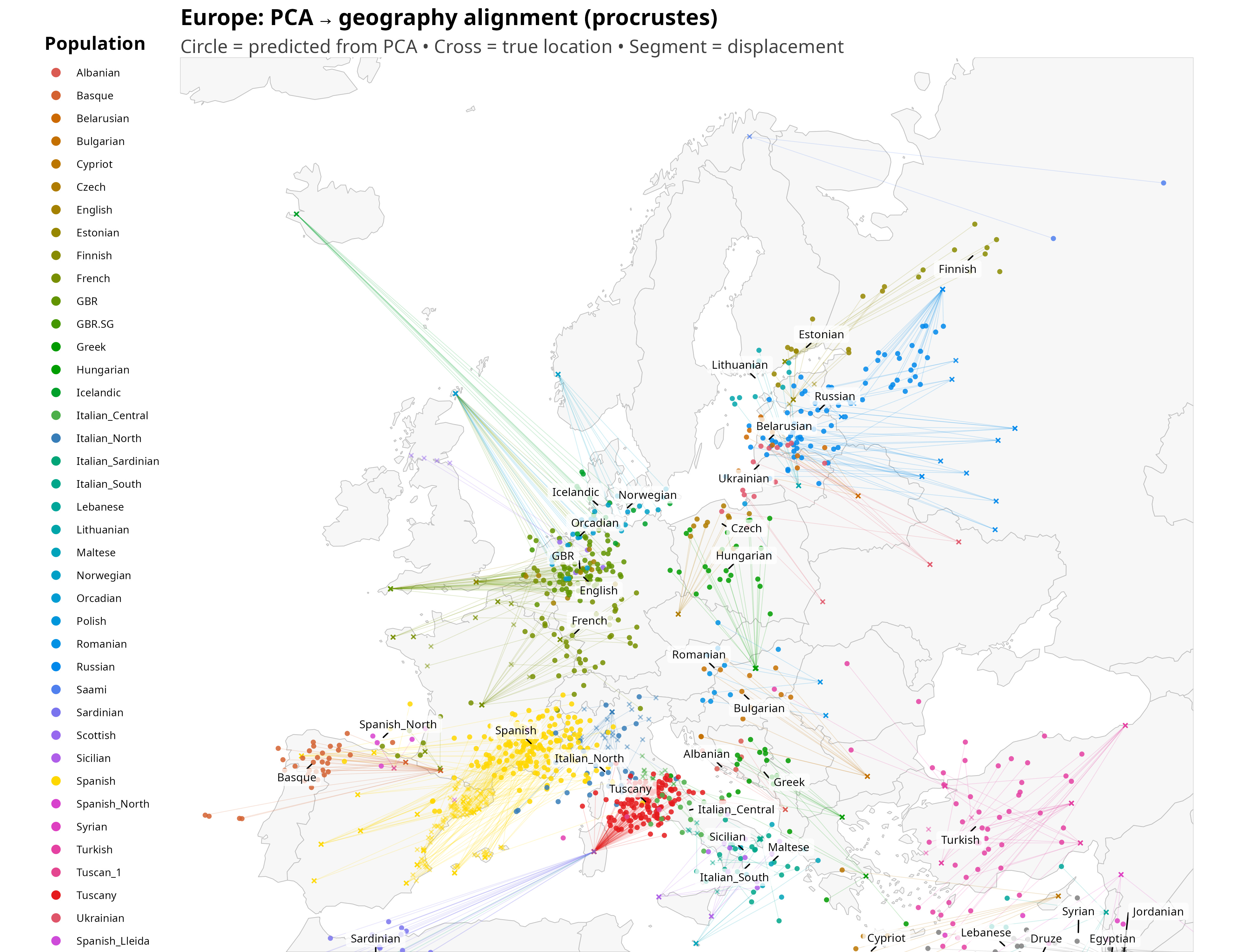
Once the eye adjusts, the displacements start to look anything but random. Several populations are shifted in directions that broadly mirror well-known layers of ancestry, even though the method itself has no knowledge of history. British samples are pulled toward northwestern continental Europe, roughly in the direction of Belgium and northwest Germany, consistent with the combined weight of Celtic ancestry linked to the Low Countries and later Anglo-Saxon inputs. Icelanders are projected toward Scandinavia, close to Denmark, reflecting their overwhelmingly Nordic founding population despite their geographic isolation.
Slavic-speaking populations tend to shift northward toward the Baltic region, a pattern that is less immediately intuitive and likely reflects the structure of eastern European genetic gradients rather than a single migration episode. French samples are displaced eastward toward southwestern Germany, plausibly echoing the combined effects of Celtic and later Frankish ancestry, while Iberian populations are nudged north into southern France, again consistent with deep Celtic layers in the Iberian Peninsula, as already suggested by the historical label “Celtiberians.”
Sardinia is one of the most dramatic outliers on the map: Sardinian samples are projected the furthest away from their present-day home, landing on the northwestern African side of the Mediterranean. In a sense, this is not surprising. Sardinians were already a textbook genetic outlier in the classic European surveys of Cavalli-Sforza and colleagues, long before ancient DNA made the reasons legible (Cavalli-Sforza, Menozzi & Piazza, 1994).
Part of the explanation is almost certainly drift. Island populations with long periods of partial isolation can move “off” the main continental genetic surface simply through founder effects and stochastic allele-frequency change, and Sardinia is repeatedly described as one of the strongest European examples of this kind of structure. At the same time, ancient DNA shows that the island’s early genetic profile was largely derived from Early European Farmers (EEF), themselves a mixture of Anatolian Neolithic farmers and Western Hunter-Gatherers, and that this profile remained remarkably stable through the Nuragic period—evidence for long-term continuity on the island rather than repeated replacement (Marcus et al., 2020).
Continuity, however, does not mean complete isolation. After the end of the Nuragic period (roughly 1200–1000 BCE), Sardinia became increasingly embedded in wider Mediterranean networks. Genome-wide ancient DNA from Sardinia shows that post-Nuragic individuals carry additional ancestry components relative to the Nuragic baseline, consistent with gene flow from other Mediterranean regions rather than abrupt population replacement (Marcus et al., 2020). Complementing this, mitochondrial DNA studies of Phoenician/Punic contexts on the island document maternal-line diversity consistent with integration and mobility across the central and southern Mediterranean, including links to North Africa (Matisoo-Smith et al., 2018; Sarno et al., 2021).
These interpretations should be read cautiously. The Procrustes-predicted locations are not migration arrows and not claims about origins. They are best-fit positions within a continent-wide genetic surface shaped by many processes such as founder effects, drift, isolation, and asymmetric admixture among them. What makes the result interesting is not that it recovers textbook history, but that broad historical structure seems to emerge at all from a purely geometric alignment between genetic and geographic space.
Measuring misalignment
Once genetic and geographic coordinates live in the same metric space, misalignment can be quantified directly. For each population, I compute the distance between its true geographic centroid and its genetically inferred centroid after Procrustes alignment. This gives a single number, in kilometres, that captures how far a population’s genetic centre of gravity is displaced from its present-day location.
Ranking populations by this distance reveals a clear pattern. Some populations are extremely well aligned: their genetic position falls almost exactly where geography would predict. In this dataset, the three closest are Italian South (105 km), Italian North (224 km), and Italian Central (239 km). At the other extreme, a small set of populations are displaced by truly large distances: Icelandic (2,022 km), Sardinian (1,243 km), and Finnish (1,003 km). These are not random errors: they are systematic outliers whose genetics place them far from where they currently live, for reasons that likely include a mix of isolation, drift, and historically structured ancestry.
Interpreting the gaps
The Procrustes overlay can be read as a rough pointer to a population’s genetic “Urheimat”: not a literal homeland, but the region where its present-day genetic profile best fits the continent-wide structure. Large displacements therefore flag populations that sit off the main genetic surface of Western Eurasia. That can happen for several reasons: long-term isolation and drift, founder effects, asymmetric admixture, or ancestry that is shifted relative to neighbouring groups. The point is not to reduce every arrow to a single historical event, but to treat the arrows as clues about which populations have unusually “non-local” genetic positions given the broader map.
A static figure already shows these patterns, but it quickly runs into a limitation: the eye can’t reliably compare dozens of populations at once, and average behaviour can hide meaningful variation among individuals. To make the map explorable rather than merely viewable, I built an interactive version that lets you select populations one by one, toggle layers (true locations, genetically inferred locations, displacement segments), and switch between misalignment summaries. This turns the plot from a nice picture into a tool you can interrogate.
For paid subscribers, the interactive map is available after the paywall.
Here is a screenshot of the app:
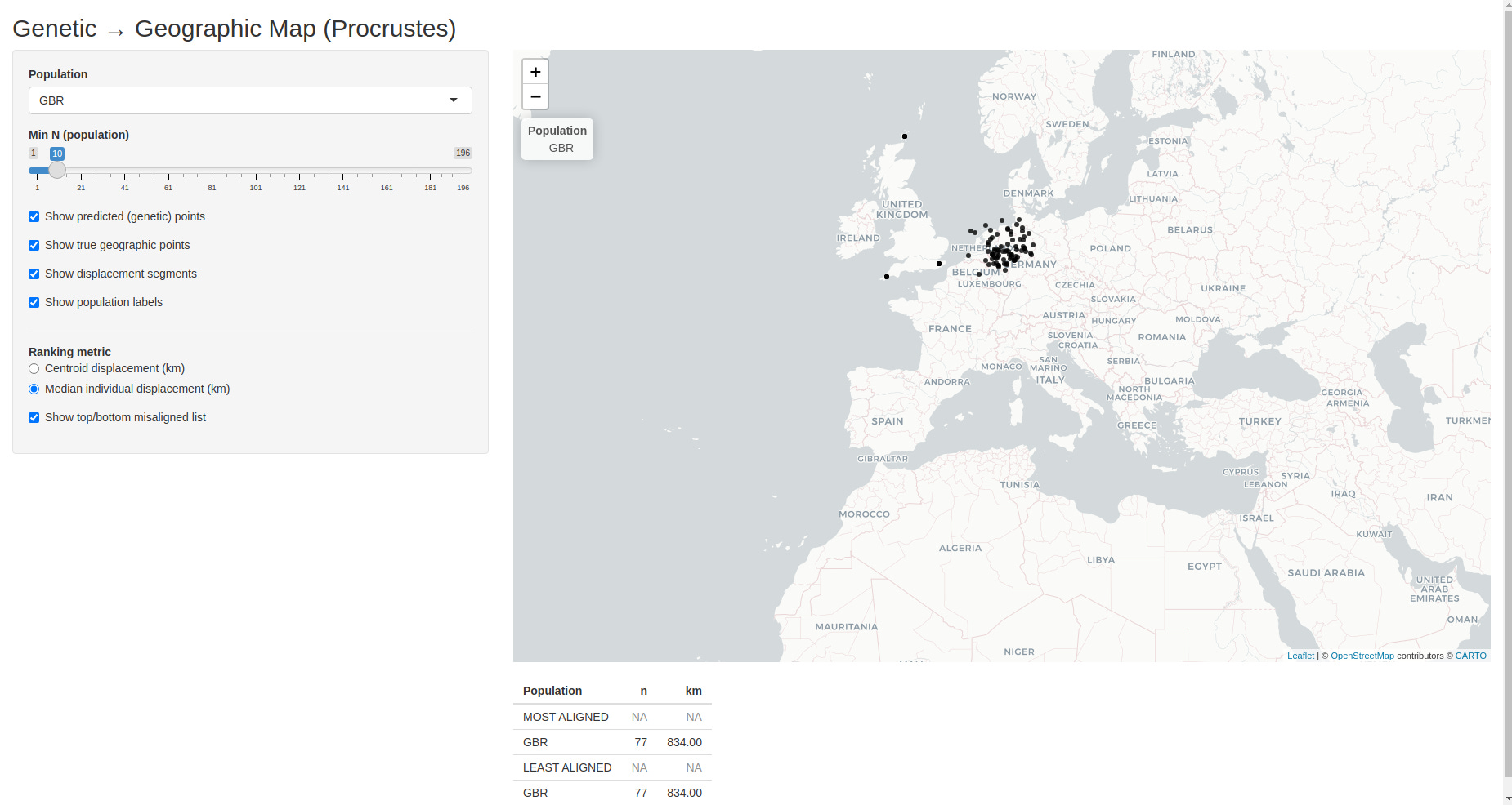
The interactive app expands on the Procrustes-aligned map shown above and lets you explore the relationship between genetics and geography in much finer detail.
Here is what you can do with it.
You can select a specific population from the dropdown menu. When a population is selected, only individuals from that group are shown, making it easy to see whether the population forms a tight cluster or displays internal spread.
You can toggle different layers independently:
genetically inferred locations (where the population “lands” in geographic space based on DNA),
true geographic sampling locations,
and displacement segments connecting the two.
These segments represent the genetic–geographic misalignment for each individual.
You can filter populations by sample size, ensuring that rankings and visual impressions are not driven by very small groups.
You can switch between two misalignment metrics:
centroid displacement, which captures how far a population’s genetic centre of gravity is shifted from its geographic location,
and median individual displacement, which captures how typical individuals within that population are displaced.
This distinction matters: some populations are shifted as a whole, while others have large internal scatter.
Finally, the app produces a live ranking of the most and least aligned populations, updating automatically as filters and metrics are changed. This makes it easy to identify populations whose genetic “home” closely matches their present location, as well as those whose ancestry points elsewhere.
